How to draw a computer first-aid kit with Inkscape
by Yuriy ApostolLearn how to complex shadows and use the 3D Box tool to draw in perspective in Inkscape

The tutorial provides example of using 3D box tool in Inkscape to create a base for a complex object in perspective and explains drawing complex shadows.
In the previous tutorial I explained basics of creating 3D looking objects in Inkscape using a snowman as an example. However one tutorial cannot possibly fit all the tricks I would like to share with you. Besides, some tools that are very much 3D related weren’t even mentioned back then.
So this time let’s draw a computer’s first-aid kit [1].
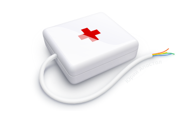
The very first thing to do is creating a base for the image. It doesn’t really sound any complicated, because it’s basically a simple box. But you just try to do it by sketching and you’ll see that unless you have a very good sense of perspective, the box will look clumsily. Then you are likely to recall that Inkscape has guides (you drag them from rulers), so you can use them to create lines that define vanishing points. All right, you use them and create three visible planes and fill them with color… only to discover that you now want to change your point of view slightly. Would you want starting everything from scratch again? There is a better way.
Inkscape has a specialized tool to draw 3D boxes. It’s very handy for creating bases for buildings, all sorts of boxes, furniture and so on. The great thing about it is that you can drag around the created 3D box in 2.5D to pick the point of view that suits the project best. And you can also change size and color of sides.
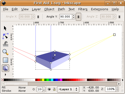
By default one of the vanishing points is set to infinity. This is useful when you need to picture an object in one plane, say, a horizontal plane. But we are placing the first-aid kit angled towards horizon. In that very case the box should have three vanishing points. So let’s disable parallelism of edges, position the object the way we need it, define final size and change colors.
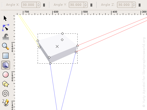
In Inkscape a 3D box is basically a well hidden (from user) group of six paths plus some extra metadata. Now that we have the box our way, ungroup the 3D box (Shift+Ctrl+G, or “Object > Ungroup”) and remove the “invisible” sides (i.e. the ones that are obscured when you look at a box in 3D). Easiest way to do it is click elsewhere to remove selection from automatically selected sides, go to Outline view mode (View > Display mode > Outline) and use Alt+Click to select the sides that you don’t see, then press Del for each one.
Now duplicate the visible sides (Ctrl+D, or “Edit > Duplicate”) and apply union boolean operation (Ctrl++, or “Path > Union”). The resulted path is a blank for the main outline of the future kit, which still has to be rounded. Let’s first create guides from this object (Shift+G, “Object > Objects to Guides”) that will cross each other exactly in vanishing points which is where we are going to need them.
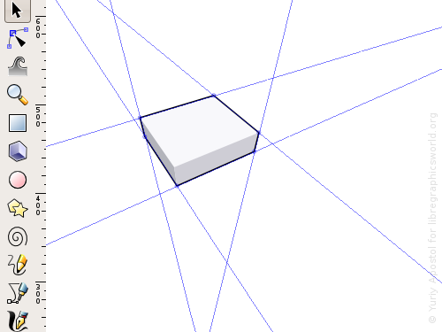
And we are going to need them right now as constraints for rounded edges of the box.
The edges are positioned between flat sides, so we can use linear gradients to imitate rounding. As a matter of fact there should be angle gradients with centers located in the vanishing points. But since angles between rounding borders are relatively small, and the lightness of sides doesn’t differ much, the cone shape of these roundings can be safely ignored, and would not have to mess around with imitation of an angled gradient.
There is another simplification to benefit from. We’ll apply gradients only to the edges we see in front of us. The ones that are further from us can be painted with blurred shadows. That way it will also be easier to show rounding of box’s vertices on same visible outline. And the vertex that is closest to us will be worked on in details later.
So let’s go back to the guides that constrain edge roundings.
When guides are created from an object, their rotation centers (small blue circles, see previous screenshot) are automatically placed where nodes of a broken line had been. Axes should be shifted (press and hold Ctrl for that) to vanishing points. Only then you should rotate guides (press and hold Shift, then drag). I recommend doing all that with snapping enabled (%, or “View > Snap”) to simplify aiming at points where guides cross.
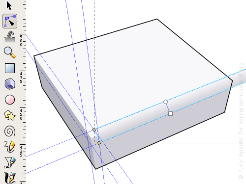
Let me remind you that the best way to create arbitrary shapes like the rounding areas here is using Pen tool to draw Bezier paths.
It’s best to edit gradients right on the canvas and pick colors for color stops right from the box’s sides. In that case the gradual transition will really look smooth as it should be. And of course direction of gradients should be perpendicular to the respective edges.
Let’s finish all three edges, filling the vertex where they meet as well. Right now that vertex looks like it’s broken, but it’s just how things are at this stage.
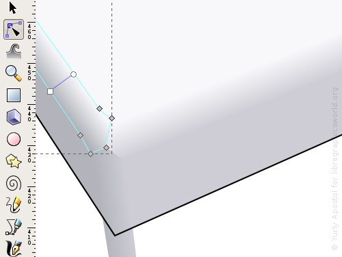
Let’s figure out what exactly is the vertex here. Basically it’s a point where three planes converge. But this “point” has a radius. And since colors of the planes gradually change, and there is some radius of transition, let’s try a radial gradient here.
Draw a triangle on top of the angle with vertices laying on tops of the flat sides. Place the center of the radial gradient in the top vertex of the triangle which is the lightest one. The opposite color stop has to have color of the darkest part of the first-aid kit. Now you need to take care of the third side. Move the gradient’s center towards it, but return the focus back to the lighter side (press and hold Shift, then drag a small cross for that). The result is more or less fine, but the top path’s borders will still be seen. You can fix that by turning triangle’s sides into slight slopes and adding more color stops to the gradient.
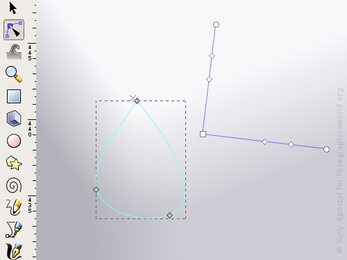
When you round top path of the box, you have to keep in mind that the visible corner rounding radius is equal to the actually defined one only as long as all three adjacent edges are seen. For corners with two visible edges rounding radius may vary from real one to zero depending on the angle of the plane with edges. I haven’t managed to find methodology of calculating such radii yet, which is why I relied on intuition and, um, used a lid of some bottle in the bathroom as a sample :)
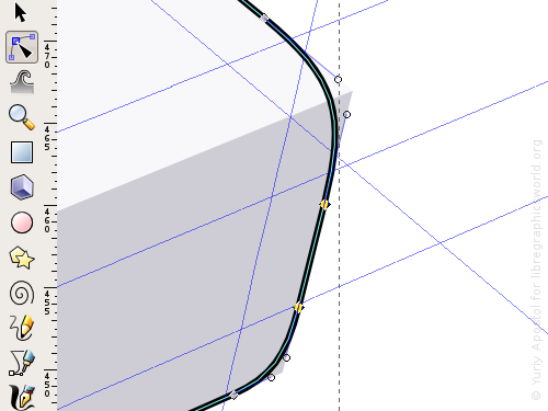
And now let’s use the outer path to create an outline shadow that will imitate rounding of the rest of the edges. For that duplicate the path, place some arbitrary larger path underneath it and subtract (Ctrl+-, or “Path > Difference”).
Apply a gradient and blur to the resulted path.
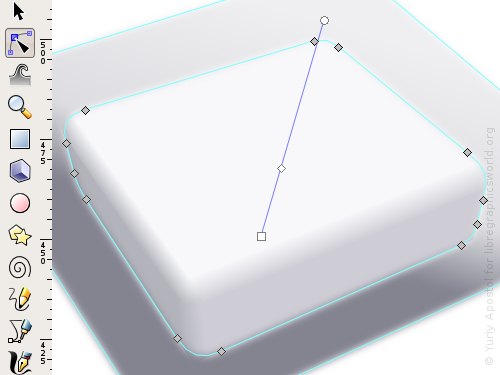
Duplicate the outer path of the kit again, group everything except it and use the duplicated path as a clipping path for the newly created group (“Object > Clip > Set”).
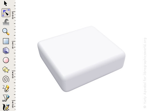
Okay, the box shape is ready now.
Use guides to draw a red cross and a fissure between two halves of the box. Round the path of the fissure on corners the same way you did it for the outer paths of the kit. Then place a highlight on top of it.
The highlight and the red cross should be filled with a slightly noticeable linear gradient. While polishing the illustration I also applied gradients to the kit’s sides.
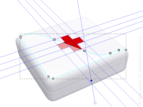
Not it’s time for the wire. You can draw it with a Pen tool using a very thick stroke and then outlining that stroke (Ctrl+Alt+C, or “Path > Stroke to Path). Duplicate the wire twice. Make the first copy lighter and shift it a little towards top. Make the first copy darker and shift it a little towards bottom, then blur both copies. Duplicate the original path again and apply it as clipping path.
Add shadows beneath the wire and the kit’s box. Use several differently blurred objects to create a complex compound shadow.
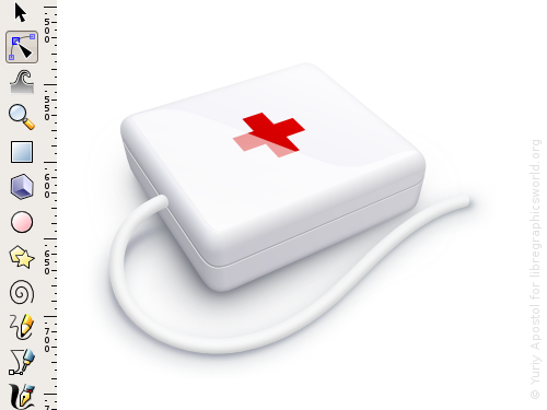
Here is what it looks like in wireframe mode:
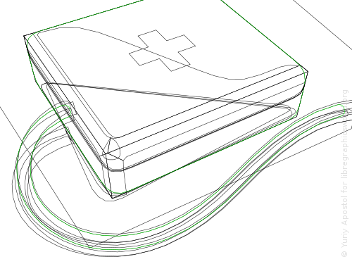
The path of the sharper part of the wire’s shadow becomes narrower towards the kit’s box. Along with blur it creates effect of decreasing sharpness.
Use the same principle for the box’s shadow. The shape of its sharpest and darkest part repeats the path of the boxes’s bottom side. It is visible just because it’s very slightly blurred. The lighter and more blurred parts jut out much further.
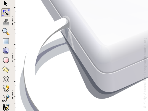
Now you can add a shadow and a slight reflection from the wire to the side of the box, then a reflection from the plane on which the box is placed. Adjust shadows and highlights on the wire close to the place where it enters the box.
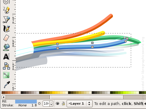
Finally, draw the thin colored wires hanging out, add some shadows and colored reflections for them.
And we are done!

[1] The phenomenon is widely spread in ex-USSR countries where people actually pay to tech support that is not affiliated with vendors they got their computers from. The service is usually called something like “PC ambulance”. Hence the first-aid kit metaphor.
Patreon subscribers get early access to my posts. If you are feeling generous, you can also make a one-time donation on BuyMeACoffee.
