With this Inkscape tutorial you will learn to draw a 3D looking snowman, but ultimately you will get a grasp of creating shadows and reflections the right way.
Inkscape is a relatively young yet fast evolving generic vector graphics editor in the lines of Adobe Illustrator and Corel DRAW. The application can be run on Linux, Windows and Mac and it’s freely distributable along with source code. Its main file format is SVG (Scalable Vector Graphics, a W3C standard recommended for publishing vector graphics on the Web).
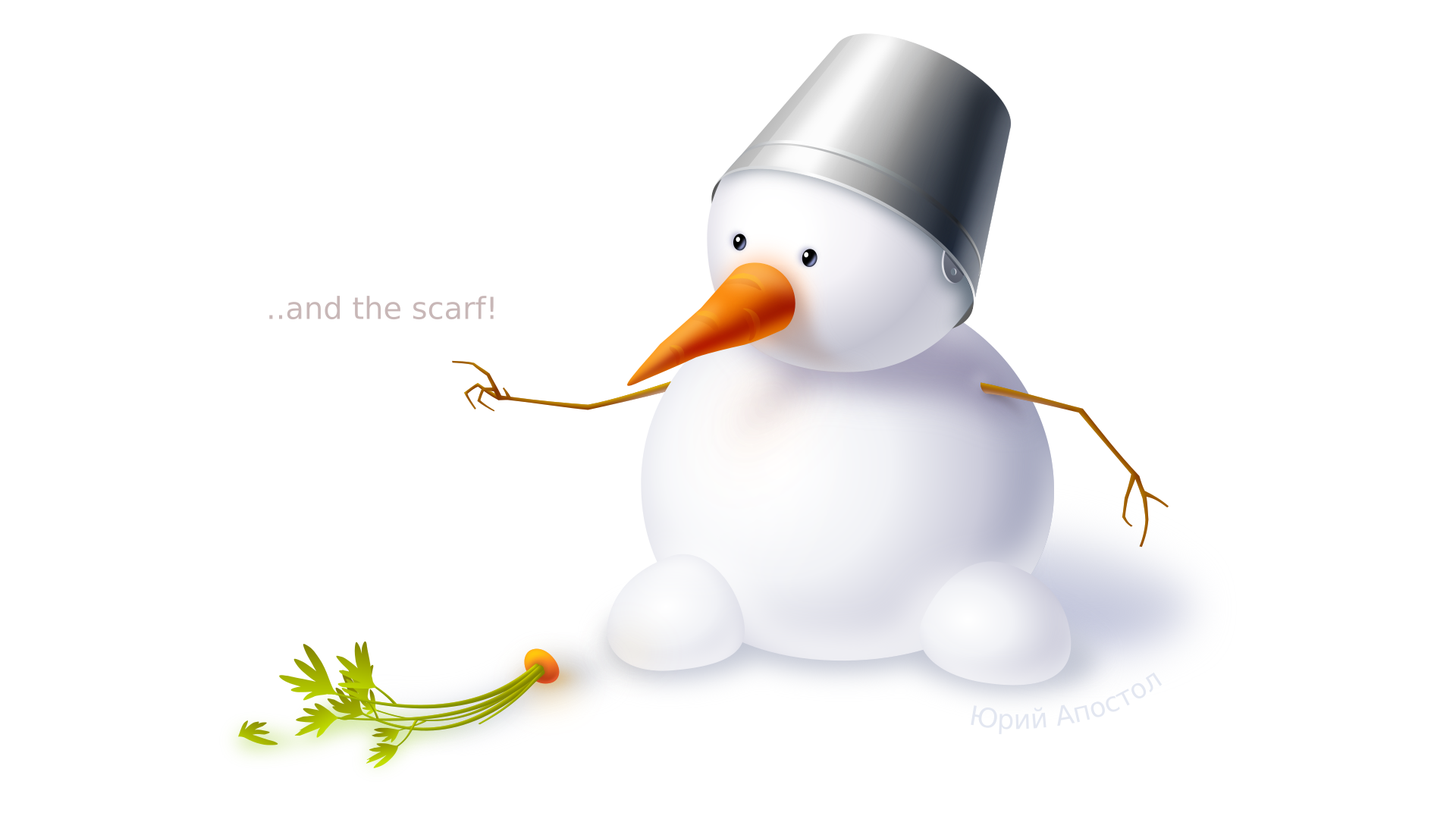
I’m going to show you how to use this great application to create 3D looking images and I’ll use my snowman postcard as an example.

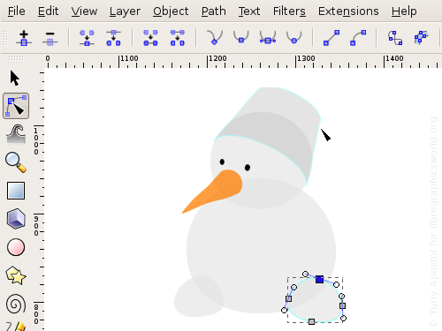
For a start let’s create very basic shapes and play with them. Inkscape has specific tools to create graphic elements like ellipses, rectangles, stars and polylines. However, if you want your drawing to look more vivid, it’s better to outline a shape (Ctrl+Shift+C) and bend it. More complex shapes should rather be drawn with Pen (Bezier curve tool). Usually I just draw a curved line and then bend it, refine nodes placement and change their type (cusp, smooth etc.).
Here I started drawing snow balls and eyes from ellipses, then I used arcs of ellipses to create bottom and top edge of the bucket. For “nose” I used Bezier curves, and the same tool was used to finish the bucket after performing union of parts of ellipses via “Paths > Union”.
Inkscape 0.47 features path outline highlight upon hovering it with Node tool. This really has made looking for a particular path a lot easier in cases when there’s a lot of them on canvas already or when they are grouped or when they are covered by other objects. And of course you still can use the good old Ctrl+Alt+Click combination using Selector tool. As a matter of fact there’s a lot of such combinations in Inkscape. The application provides hints about using them in the status bar, so it’s easy to learn them.
Let’s keep drawing. Now that we are done with base shapes, let’s go for three-dimentionality. To create smooth transitions from light to shadow we’ll use gradients and for more complex cases we’ll combine them with Gaussian blur.
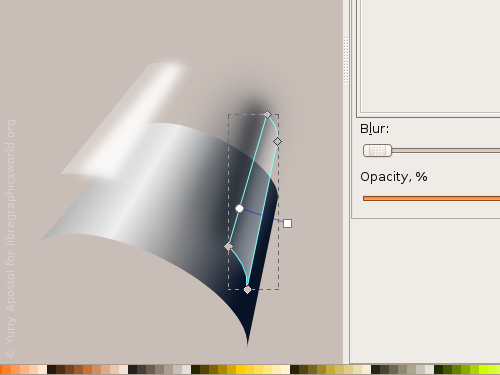
One of the ways to apply a gradient fill to an object is to use a flat fill first, and then switch to Gradient Fill Tool, in the tool’s options toolbar choose the type of gradient fill — linear or radial, and draw over the object. In that case the chosen flat fill color will gradually fall off to 0% opacity. In the very same toolbar you can click “Edit” button to open a dialog where you can manage color stops of the currently used gradient.
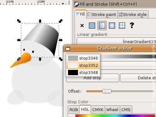
However, in most cases you really want dragging color stop and changing their colors right on canvas. Just pick the Gradient Fill Tool and click with it on an object. The very next thing you will see is handles that you can use to change position, direction and linear size of the gradient, shift color stops, add (double-click on the line) or delete them (use Del key on the keyboard). You can also press Shift and move focus of a radial gradient away from center.
By the way, gradient handles are displayed when you edit nodes which is very handy for adjusting objects look and feel really fast, even though in that case you won’t be able to add or remove color stops, only move them around.
When you click to select a color stop, in the Fill’n’Stroke dialog you’ll see only the color of that color stop. This is probably not quite expected, but in the end it makes managing gradients quite easier than via the aforementioned old-fashioned dialog.
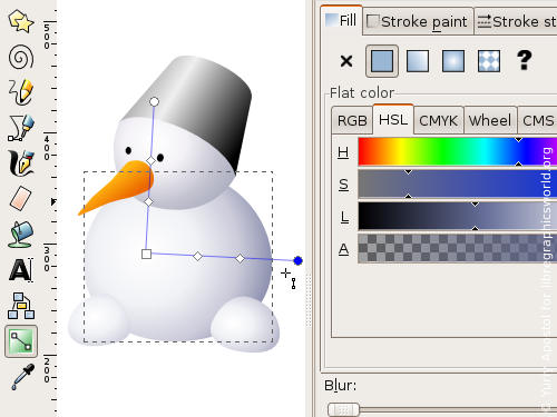
Make sure you play with different color models long enough to pick your favorite or just the one that suits the task best. To work on color I usually use HSL, because I get better precision due to being able to adjust brightness and saturation for a hue of interest selectively. Inside the document values of colors are usually saved as RGB plus alpha channel, so it doesn’t make much sense using CMYK when tweaking colors, if you expect to print the drawing commercially later.
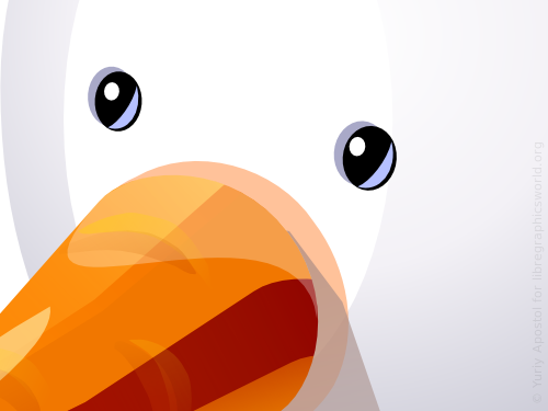
Unfortunately, there is a number of other limitations. For example, to better represent shape of the bucket and the carrot a conical gradient fill would be best, but since SVG lacks this type of fill and therefore Inkscape lacks it as well, we’ll do out best to work around this.
The simplest thing you can come up here with is interpolation of a thin segment or a rectangle of same color to a differently filled and rotated copy of this very shape. To do it select both path and apply the “Extensions > Generate from Path > Interpolate…” effect.
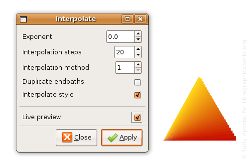
Now you can blur all the segments created by the effect and thus make intermediate steps much less visible. The only thing to mention here is that it’s better to first group all the intermediate paths (Ctrl+G or “Object > Group”) and then blur them, otherwise every object will be blurred separately, so the final look won’t be as good. The easiest way to apply blur is to drag Blur slider in the Fill’n’Stroke dialog.
I don’t really favor this approach with interpolation, so I decided to simulate angled gradient by blowing up radius of hues blurring from vertex of the cone to its base.
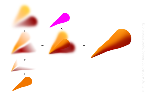
To create light and dark areas I just duplicated carrot’s path (Ctrl+D or “Edit > Duplicate”), rotated it around cone’s vertex (double-click the object and drag rotation point to the vertex), changed the color, added a gradient and blurred. I needed gradients to distribute blurred hues along the cone.
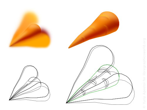
But surely I couldn’t leave everything out of boundaries of the carrot as is, so I cropped it by applying a clipping path. Carrot’s shape was just fine for that, so I duplicated it again, then grouped all parts of the carrot except the clipping path shape and applied that shape to the newly created group (“Object > Clipping Path > Apply”). Usually I fill the clipping path with some specific color so it stands out among similar ones not to be mixed with them. You can’t see a clipping path after you have had applied it, but you can still edit objects that are clipped.
Now let’s finish the carrot and add a couple of light slopes on the “nose” and a reflection of snow from beneath. Then use either Calligraphic Pen or Pencil tool to draw “eyes” on the carrot.
Talking of reflections… They are actually as important as shadows and highlights. All objects more or less reflect light, and the reflected light hits other objects lighting them as well as it goes along. Even more, objects with a very saturated color, like our carrot, usually colorize objects around them wither way. This is why we don’t really see pure white snow or pure white sheet of paper — we see some hues.
I made snow balls blueish from the very beginning, assuming that the snowman will be under clean blue sky somewhere. Now I only need to add shadows and reflections.
When you work on dropped shadows, you need to bear in mind that the further they fall from an object, the more blurred they should be. Sharpness of shadow borders very much depends on the lighting source.
Now let’s work on the bucket. The gradient I used in the very beginning is good enough already even though it’s linear, so I’ll just fix it a bit. First I added a highlight from sun — a blurred white segment, then I accentuated the cone using a shadow — some more blurred dark stripes. And finally I put on top of all that a couple of transparent light gradients representing a reflection from snow and a highlight from top. The highlights and shadows objects were created by duplication of the bucket’s object itself and consecutive removal of its parts that I didn’t need. It is better to draw shapes of blurred hues using Pencil.
I used dedicated clipping paths for both the bucket and the snow balls. The clipping paths were used to clip blurred objects just like before for the carrot.
Now you need to add an “eye” to the bucket and extrude a grooving. I decided against painting a bucket handle to not introduce visual noise.

Edge of the bucket and the grooving I created from copies of the ellipse that is used to build up bucket’s outline. Two such ellipses were shifted relative to each other by width of the edge, then selected and subtracted (Ctrl+- or “Path > Difference”).
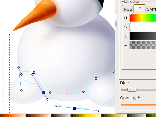
As for the eyes, everything’s really simple: a highlight, a soft reflection of light in the pupil and a shading above the eyes to make them stand out a bit. Here is what it looks like in the No Filters view mode (“View > Display Mode > No Filters”):
And yet another important thing. Even though its a vector image, the plan was to publish its small size bitmap version, so I chose the size from the very beginning and took it into account when drawing all the tiny details. Eyes, thin lines on the bucket, fingers — all of these elements had to be aligned to pixel grid. So what I did is toggling wireframe view mode (Ctrl+5 on the numeric keypad or via “View > Display mode > Outline”), enabling grid (# or via “View > Grid”) and then moved objects and bent curves so that paths preferably were inside grid cells. This is why the final image looks so crisp.
Arms of the snowman are slightly curved lines. I used a flat fill for them and added light reflections to add 3D feel.
Leafs of the vegetation was drawn mostly with Calligraphic Pen and then the resulted strokes were united via boolean operation and filled with a linear gradient. The Calligraphic Pen’s options are more or less these:
- Thinning: -60 (strokes become thinner as you lower speed)
- Caps: 2 (slightly protruding)
- Fixation: 0 (pen is perpendicular to stroke)
- Angle: 0, not really important for fixation
But I used a stylus, so the pressure sensitivity option was enabled too, which is why strokes look more natural, with sharp caps.
Stalks are flat-filled paths highlighted by their lighter and blurred copies.
To make the carrot’s stub more dimensional a couple of blurred spots will suffice.
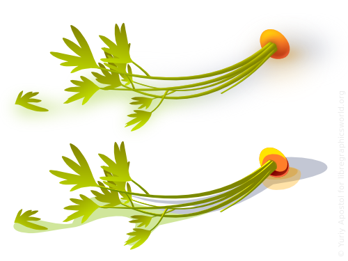
Don’t forget about shadows and reflections on the snow: the sky will give us a blueish shadow, the green vegetation and the carrot will give us greenish and orange spots.
That’s about it. Below is the final version in _No Filters_ mode:

You can also download the file which is licensed under terms of CC Attribution Non-commercial Share Alike, meaning you can edit and share it, but can’t sell and have to credit the author when sharing.
Patreon subscribers get early access to my posts. If you are feeling generous, you can also make a one-time donation on BuyMeACoffee.