GIMP 2.10.18 full review
by Alexandre ProkoudineThe new version of GIMP is full of usability fixes, new features, overall improvements, and bug fixes.
The new version of GIMP is full of usability fixes, new features, overall improvements, and bug fixes. Let’s dive right in!
But first, the usual disclaimer for cases whenever I make a dedicated post about GIMP. Apart from writing for Libre Graphics World, I’m also a non-coding contributor to GIMP, so if you suspect that I could be biased about this program, that’s because I am.
For this particular release, I shot a video that covers most of the changes in this version. But since not everyone likes videos, below is the full transcript.
Now, as you probably know, starting with the 2.10 series, new features are allowed into stable releases. Which is why we’ve seen major improvements coming to end-users on a regular basis just several months apart. Which is a lot better that having to wait for 4 to 6 years.
The new version is especially exciting because it fixes quite a few gripes people had with GIMP. So let’s start with those.
Toolbox revamp
The first thing you are going to notice immediately is that the toolbox got smaller. That is because tools are now logically grouped by default, just like in some other image editors that you might have used in the past.
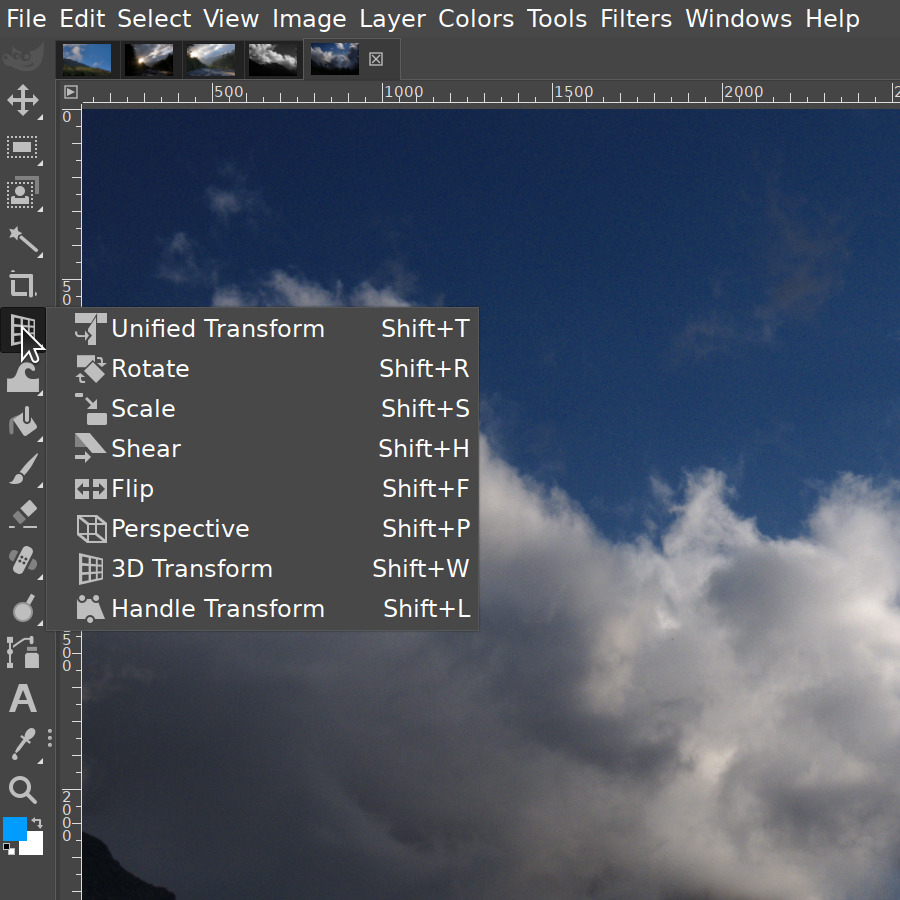
To open the list of tools, left-click and hold or just right-click. Another, not quite discoverable way to change a tool in a group is to hover the group and then scroll the mouse wheel.
Instead of cramming all tools into groups like Selection and Transformation, Ell took a better approach and made several groups for both based on the kind of interaction they rely on. E.g. Free Select, Scissors, and Foreground Select are grouped together, as they have interaction similarities. So are Warp Transform and Cage Transform, as they both are what I would call local transformation tools.
The overall effect is that the toolbox looks cleaner, especially when you don’t dock any dialogs below.
I know from reading the feedback that people generally cheered on this change, but not everyone agreed. So while these are the new defaults, you can go ahead and customize the hell out of this feature.
For that, go to Edit > Preferences > Interface > Toolbox.
Now, you can disable this feature entirely by ticking off the checkbox that says “Use tools groups”. Or you can make your own groups and reorganize tools the way you like it by just picking and then dragging tools around. The changes will show up in the toolbox immediately.
New docking behavior
By the way, if customized GIMP to only show the toolbox at the left side, this message here probably used to annoy you a lot. Well, now it’s gone. And since there had to be some replacement for it to make docking obvious, GIMP will now highlight dockable areas when you start dragging a dockable dialog.
New higher-contrast icon theme
And then the next change quite a few people might like is a higher-contrast variation of the symbolic icon theme. There have been numerous reports that the new default symbolic icon theme doesn’t have enough contrast. So this is a temporary workaround for people who want a bit more punch in the toolbox.
The customization interface is right where it was: on the Icon Theme page of the Preferences dialog. The team is looking forward to improving this further in the GTK3-based version of GIMP where it could be possible to use CSS to customize icon themes, similarly to how it works in upcoming Inkscape 1.0 version.
Smoother brush outline motion on the canvas
The next change that is very much visible is the new compact style for the sliders.
Now, I know I’m a GIMP contributor and I’m supposed to be fighting for all its quirks to the death. But seriously, the old slider sucked so much even though it was actually added to improve the user experience. Which it did, but only up to a point.
The vertical separation into small and default increment was not very discoverable for new users and not all that convenient to experienced users. The numeric input field simply got in the way. And the height of the widget was so large that for tools with a lot of options like the Paintbrush, people had to scroll up and down to move around settings all the time.
OK, so the new compact style for that widget changes a lot. It’s small, so you get to see more, it allows changing values with default, smaller, and larger increments, and the numeric input is just there for when you need it.
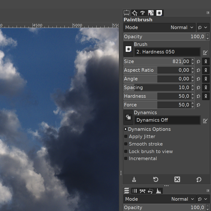
This is how the interaction works now.
- You can just single-click with the left mouse button anywhere to set a new value. That’s not new, it’s how it already worked before.
- You can left-click and drag to change a value with a default increment.
- Then you can press Shift and left-click and drag (or just right-click and drag) to change a value with a smaller step. This is something people commonly do when they use a small brush and need to change the size just a little bit.
- You can press Ctrl and left-click to change a value with a larger step. Like, going from a small brush to a much larger brush very fast.
Instead of left-clicking, you can use all these new modifiers with the mouse wheel scroll.
Now, about the numeric input. Whenever you click anywhere on the slider, the numeric input mode gets activated. But it doesn’t really get in the way. The blinking text cursor just sits there waiting for your input. Simply type the value and press Enter or Tab to confirm. You can deactivate the numeric input by pressing Escape.
There are two more things worth telling here. First, you can middle-click on the slider to just enter the numeric input mode without changing the value. And if you right-click, you both enable the numeric input mode AND select the value which is handy if you want to replace the value completely rather than adjust it.
Again, you can disable all this as well. I really have no idea why you would the old gigantic slider back, but you can do it in Preferences.
Improvements for global transformation tools preview on the canvas
The next series of changes makes global transformation tools way more usable.
Composited preview
It starts with the new Composited Preview option that essentially fixes a hackaround introduced many years ago. Here’s the problem.
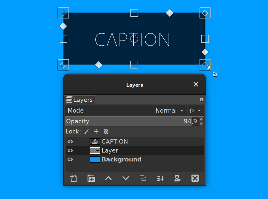
When you have multiple layers, each one with its own blending mode and opacity, transforming it means it pops up right above every other layer. So in a complex layers composition you can’t align this layer against other layers without much trial and error.
The new Composited Preview option removes this hackaround in favor of rendering the preview of the transformed layer exactly where it is in the layers stack, exactly with the blending mode of choice.
Synchronous preview
It comes with a suboption called Synchronous preview that is more experimental. The idea is to render the preview as soon as you change the transform. So instead of waiting for the mouse to stop moving, it renders the result immediately. If GIMP can render everything fast enough, this means a much smoother and more instant feedback.
But this option also blocks everything until the preview is done rendering. This means, GIMP can become much less responsive, usually when the layer is very large. That’s why this is disabled by default.
And then there’s another new option to enable displaying transformation of all linked layers rather than the currently selected one. Again, something people have been expecting to happen for many years. I believe the relevant bug report was filed 16 years ago.
New in development: you can now optionally preview the transformation of all linked layers. This partially fixes a bug reported by @jimmac 16 years ago :) Once mipmaps hit GIMP, all these new options will become the expected default behavior. To be released in version 2.10.16. pic.twitter.com/cAlZX9edjJ
— GIMP (@GIMP_Official) January 18, 2020
Why they are all optional
Now, all that might seem like too many optional features that should be on by default anyway. The reason why these are all options is that these things tend to become sluggish as image size gets larger.
All of this will change once the mipmap rendering lands to GIMP.
If you are not familiar with the concept, the general idea is to separate what you see on the screen from the actual data. On the screen, you would see a smaller version of the image that you would transform or apply filters to, and in the background the program would silently process the full version of the image. This is quite similar proxies in video editors.
This way, working on large images will become a lot faster, and there will be no need to keep this sensible new behavior disabled by default.
Clipping preview on the canvas
Another change here that is, in fact, not optional is the clipping preview on the canvas. Supposing you rotate a layer. Once the data goes outside the layer boundary, you have several options how GIMP should clip it.
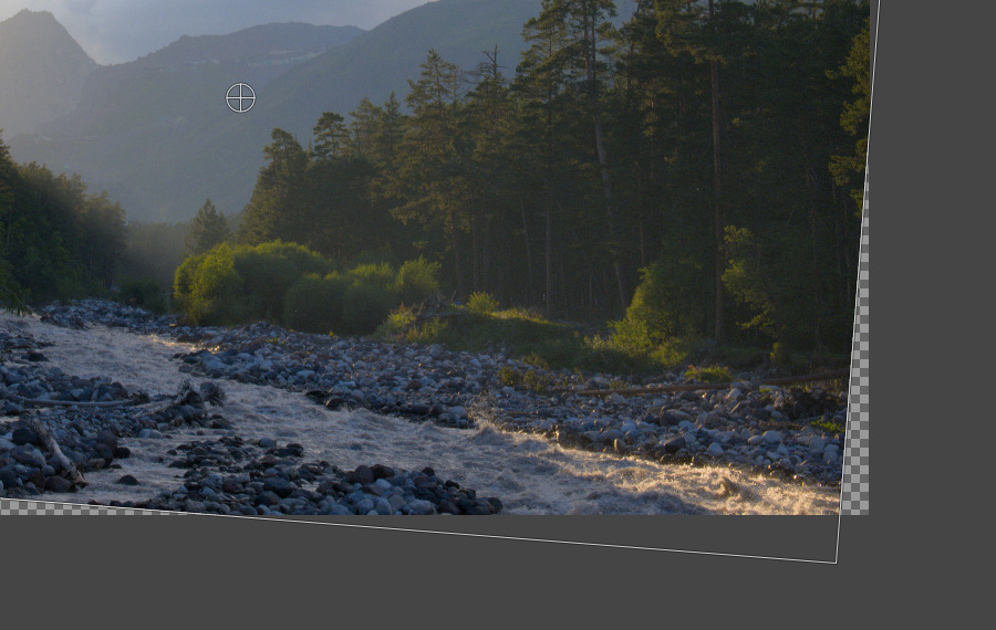
- ‘Adjust’ is the default option and it means no clipping. It does looks clipped by default. But if you enable the ‘Show all’ option, there it is.
- ‘Clip’ means just keep whatever is inside the layer boundary and drop the rest.
- ‘Crop to result’ will try to find the largest possible rectangle of original data inside this rotated bounding box.
- And ‘Crop to ratio’ will do the same while maintaining the original ratio between width and height.
So what’s different about it is that previously GIMP displayed the cropping only after you applied the transformation. Which means more trial and error. Now you get to see everything while doing the transformation.
New 3D Transform tool
Another major change is a whole new global transformation tool called 3D Transform. It’s more of a 2.5D transform really but that’s beyond the point.
This is going to be helpful for cases when you need to rotate an image as if it was stretching towards a vanishing point. Unless you are trying to align a screenshot over a blank screen in a MacBook Pro mockup and thus have the real perspective reference, using the Perspective tool requires quite a lot of patience.
With the new tool, you don’t have to try hard to make the perspective stretch believable. You just switch to the tool, change the vanishing point position, if you need to, and then rotate. Or pan. Or both. That’s all.
At your preference, you can either drag sides of a layer on the canvas to rotate like in a 3D modeling software or use numeric input in the on-canvas dialog.
The new 3D Transform tool got a 'Unified interaction' option where you can reposition the vanishing point, move, and rotate depending on where you click and drag. No need to switch between modes. The new tool will be part of version 2.10.16. pic.twitter.com/cG2Nx4Gb0q
— GIMP (@GIMP_Official) January 11, 2020
You can use modifiers to constrain rotation to just one axis of your choice. And once you rotated a layer, you can enable e.g. the Z axis constraint and the ‘Local frame’ option to rotate the layer on the imaginary plane that this layer is now part of.
Now, in all honesty, I don’t think that Ell is trying to turn GIMP into a full-fledged 3D modeling software or texture painting software. We already have great free tools like Blender and ArmorPaint for that.
However, there are quite a few valid design uses for transforming objects in 3D. Basically, any design that needs believable perspective would greatly benefit from this. Especially if it will become possible to rotate and scale in 3D in one go.
Smoother brush outline motion on the canvas
The next chunk of updates is for people who use GIMP for drawing and painting. Starting with this version, you should see a much smoother brush outline motion. There are two major reasons for that.
One is that several releases ago, Ell, who is one of the most active GIMP developers, separated translating the brush strokes to actual dabs, and updating the display. These are, in fact, two different things.
See, when you paint in software, you drag a mouse or a stylus on the canvas, and that sends some information to the brush engine: how fast you draw, in what direction, how much pressure you apply while drawing, whether you rotate or tilt the stylus and so on.
The brush engine takes all that into consideration, maps it to various brush settings like size and spacing, and then turns all this data into actual pixels written to the layer that you paint on. Then it updates the display which means showing both the dabs you made and the brush outline.
New in development: higher canvas update rate for painting tools makes brush outline motion much
— GIMP (@GIMP_Official) February 4, 2020
smoother :) Patch by Ell. To be available in 2.10.16 soon. pic.twitter.com/Qwxm72RbH6
Until fairly recently, this approach meant that the brush engine couldn’t go back to translating your brush strokes into pixels until display update was complete. From users’ standpoint, it looked like the software couldn’t keep up with your drawing. And that was really frustrating if not infuriating.
So Ell fixed that several releases ago, and now GIMP translates brush strokes into pixels and updates the display separately from each other. The rate at which brush strokes were rendered to the display was already high enough, so the last missing bit was a higher refresh rate for brush outlines. It was literally a one line fix in the source code — changing the rate from 20 fps to 120 fps — and it made a lot of difference visually.
And then there’s a second reason why brush outline motions are now smoother. Before, GIMP used to snap the outline to the center of the last brush dab. It was mostly visible when you used large spacing values. Ell made this snapping an option that is disabled by default. So now painting with large spacing between each dab shouldn’t feel nearly as choppy as before.
Faster loading of Photoshop brushes (ABR)
For people who use a lot of Photoshop brushes, GIMP will now start a lot faster. Before, GIMP used a very inefficient way to load these brushes. It was fixed just a week before this release.
To give you idea, I did a quick test and downloaded a bunch of ABR files, some of them provided by a fellow GIMP user Sevenix.
I ended up with 214MB of those brushes. Then I built two versions of GIMP — one before the fix and one after the fix. Then I used the performance profiler that Ell created a while ago.
This feature writes a log of how much time it takes to do certain operations in the program so that developers could investigate various inefficiencies. In this case, I was interested in how much time it takes to load all brushes at the startup.
So here is the performance log viewer showing the first log where there is no fix.
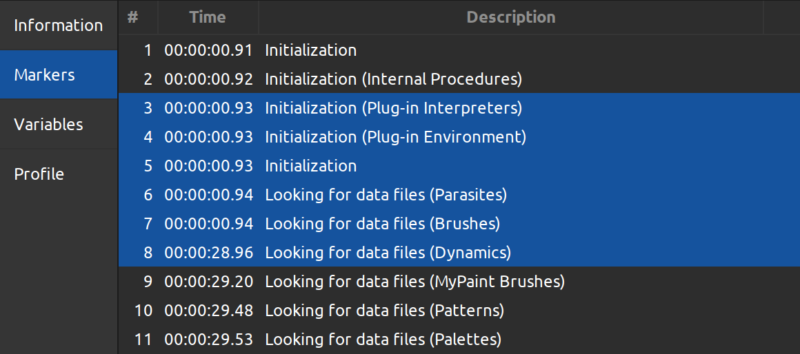
As you can see, that’s a little over 28 seconds. Not exactly unbearable, but a really, really long time.
Now, here is the data for the version of GIMP where this is fixed.
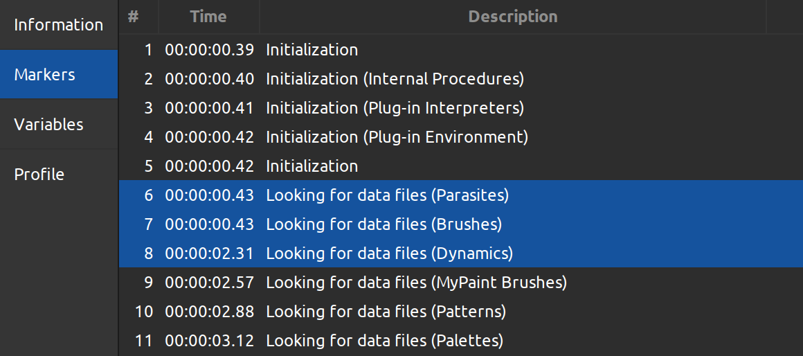
We are looking at a little less than two seconds of time spent parsing and loading ABR brushes. Again, that’s 33 files and 214MB of data. That’s actually not too bad!
Of course, you should keep in mind that absolute numbers will vary between different computers depending on the specs. For example, this is a laptop with an SSD. If you have an HDD, these numbers will be quite different. But the magnitude will be about the same.
It’s highly likely that Ell will eventually apply the same lazy loading magic to resources such as brushes and patterns that he used for fonts almost two years ago. So GIMP will skip these resources at the startup time, show you the interface, and then load these files. At this point, I can’t say which version of GIMP will have that though.
Further UX improvements
There are also two small convenience changes.
New pivot selector widget
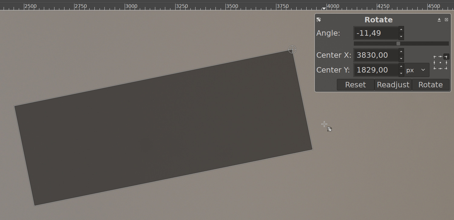
First is the new pivot selector widget that you can see on the on-canvas dialog for the Rotation tool.
Supposing you want your layer to be rotated around a point that isn’t the center of that layer. Before, if you wanted that pivot point to be, say, the middle of the left side here, you had two options.
One was to try really hard to drag the pivot exactly to the middle of the side, which usually means squinting and swearing. The other option was to calculate the position of a guide so that it would go exactly through the middle of the layer, and then drag the pivot to snap to the intersection of the guide and the layer’s boundary.
Now you have this little widget where you can click to set the pivot’s position to one of 9 commons presets: the center, one of 4 corners, or one of 4 midpoints.
Consolidated UI for merging layers and anchoring floating selections
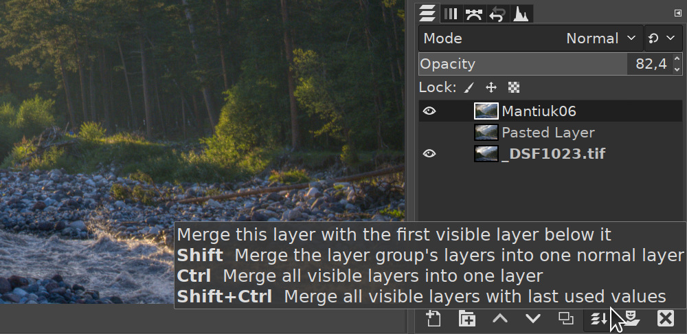
Another convenience change was introduced by a new contributor who calls themselves woob. The Layers dock now displays the anchor button only when there’s a floating selection in your project. When there isn’t one, it will display a button for merging layers instead.
This button can also be used with several modifier keys.
If you want to merge all layers inside a layer group, select the layer group, press Shift and then click the button.
If you want all visible layers to be merged, press Ctrl and click the button. You will see a dialog with some options.
And if you want to merge visible layers with the settings that you last used in that dialog, press Ctrl and Alt keys together, then click the button.

New release availability checker
The last major change in this version, introduced by Jehan Pagès, is the automatic check for new version availability. Now every time you start GIMP, it will check whether a new version of GIMP has been released.
All it does is reading a file on GIMP’s server that says what version is the most recent, and then compares that release version to the one currently installed on your computer. If there is an update, it will tell you so.
This is handy because there are quite a few users out there who don’t follow the development and miss out on updates bringing bug fixes, usability improvements, and new features.
The update checker also looks for new revisions of existing new versions. Here is what it means.
GIMP relies on quite a few 3rd party components for things like reading this or that file format. Like any other software, these components are prone to bugs and security issues. So when there is a fix for an issue that affects GIMP users, developers of GIMP typically repackage installers to include the updated 3rd party component. Since no code in GIMP is changed, this does not qualify as a new version.
So if you are a Windows or macOS user, GIMP will now tell you if there’s an updated installer available.
What’s coming in 2020
Finally, let’s talk about what’s coming next for GIMP.
While the team keeps making new 2.10 releases at a steady pace three or four times a year, their real focus is completing the GTK3 port of GIMP and the refactoring. Here is why this is important.
Everybody, including developers, wants GIMP to gain non-destructive editing as soon as possible. This is scheduled for version 3.2. It has been this way for quite a few years now, it wasn’t postponed, nothing has really changed.
But right now, GIMP relies on the old version of the user interface toolkit. This version has bugs, it isn’t really maintained, and developers of GTK don’t even review patches for that obsolete version of the toolkit. Which is also understandable.
Besides, HiDPI displays are now pretty much the norm, and unlike GTK3, the second version of the toolkit doesn’t handle them at all. GIMP developers had to invent clever ways to trick the toolkit into working on HiDPI displays, and it all falls apart once you work on two displays with mismatching resolutions. And that’s just one of several scenarios where things go wrong.
So GIMP really needs to move to the newer version of the toolkit to stay maintainable.
The other part of the effort is internal refactoring. What it means is that when developers look at the code they wrote years ago, they tend to find mistakes.
Now, some of those mistakes are easy to fix, but some are design decisions that seemed like a good idea at the time, but eventually turned out to be wrong.
At some point, there are so many bad design decisions that you cannot build new features that will work reliably and perform well.
GIMP is 24 years old this year, it’s also around a million lines of source code. So, as you can imagine, refactoring is not an easy job to do.
However, it seems that soon enough the first development release will be made. This will lead to several more development releases all essentially making the program more stable.
It usually takes two or three development releases for GIMP programmers to get the idea of how much more work has to be done until they can safely cut a release and call it stable.
So for 2020, we are most likely looking at two or three more 2.10 releases with new features and bug fixes, and maybe one or two development releases in the 2.99 series. Again, this is just my gut feeling. I could be entirely wrong about that, we shall see.
You can download GIMP at the usual place over at gimp.org.
Patreon subscribers get early access to my posts. If you are feeling generous, you can also make a one-time donation on BuyMeACoffee.
