Red Hat releases free/libre Overpass font family
Red Hat announced the release of Overpass, their own highway gothic font family designed by Delve Fonts. Overpass is available under terms of SIL Open Font License.
In 2011, the company commissioned the project to Delve Withrington. The idea was to reuse Standard Alphabets For Traffic Control Devices and adapt it to screen resolution limits. Originally Delve and his team created just Regular and Bold upright faces. However, in 2014, Red Hat returned to Delve and his team for more weights and faces: under Delve’s direction, Thomas Jockin drew the Light weight, and Dave Bailey assisted with drawing the italics.
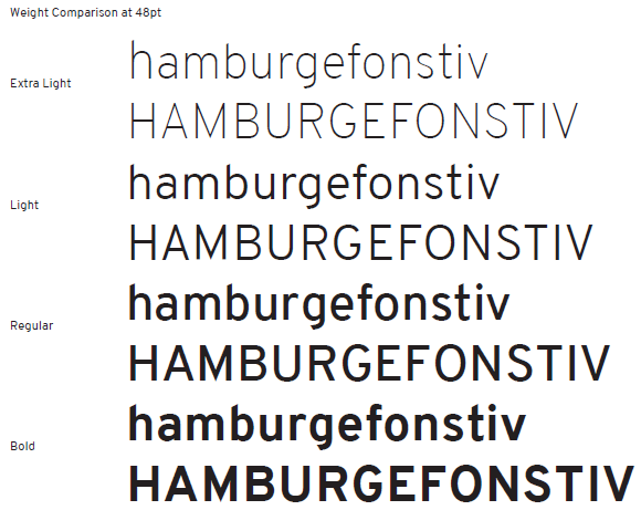
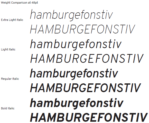
The first public version of the font family is available in Extra Light, Light, Regular, and Bold weights, in both upright and italic versions. So far Overpass has complete Extended Latin coverage and support for a variety of OpenType features such as fractions, ligatures, localized forms etc.
You can download Overpass as TTF files, as well as WOFF, SVG, and EOT. If you are willing to tweak/enhance the font family, source VFB (FontLab Studio) are available on GitHub (it would be nice to have UFO there as well).
We spoke with Andy Fitzsimon, a brand manager at Red Hat, about the history of this project and further plans.
Overpass is based on a typeface standard for spatial navigation. Why did you pick it for user interfaces and internal websites? Is it because it’s something people are already accustomed to?
In the earlier days of the Red Hat brand, a way-finding typeface was chosen for various reasons. One quality that I’ve always liked about Highway Gothic, is that it has global cultural association with a common good.
Also, with such prominent characteristics on many glyphs, particularly the angle on many ascenders, It’s a self-governing system to write with. Writing needs to be informative, short and to the point to be visually appealing. That’s the type of writing Red Hat wants to do: concise, helpful, and standards-born.
How and why did you choose Delve Fonts to commission the project to?
The Overpass story started with a software distribution branding need. Highway Gothic had the brand look Red Hat was using but not all the options a typographer expects (or any high quality, open source font files).
Red Hat material was already using a commercial digitization of highway gothic that had all the bells and whistles designers love (various weights, condensed text, italics etc). But using that font meant designs had to be rendered in precomposed images, in print and other graphics before being used.
It didn’t make sense to buy a commercial font license for every customer and every community member who touches our software. So branded strings of text had to be baked into images by trained designers with a license. You can see how that would be frustrating if we tried to typographically brand ever-changing UI elements.
The commercial digitisation of Highway Gothic Red Hat was designing with previously was not available as a webfont and quite honestly is still not suited as one, due to the print-focused detailed node coordinates — meaning a larger file size, than is common with similar webfonts.
At first, regular and bold variants of Overpass were commissioned by our engineering department for use in desktop and web UI’s to retain the Red Hat corporate look.

Andy Fitzsimon
One thing to note: the Overpass regular variant is more of a bold and Overpass bold is more of an extra-bold. which is fine for nav bars and buttons that need to be …bold. But when I came on board to the Brand team, my first request from my boss was that we take over the project and expand the series into a light (regular looking) weight for use on the web so that our digital content was a little less “shouty”.
I reached out to Delve as the designer of regular and bold to continue the project and he did a tremendous job!
We put the light weight through it’s paces on redhat.com and even used it as the default weight when we made presentations using reveal.js and other websites.
Since that expansion was a success, we moved onto expanding the series with true italics for use in citations and testimonials. We also added extra light and it’s italic equivalent so that we could get more conversational when using large font sizes.
Now we’re effectively at our first stable release for the entire family — and we are pretty happy to use Overpass as-is for a while.
We chose to continue to work with Delve Fonts for the entirety of the project because that’s our working style. We know we’re lucky when we have direct contact with a creative expert. Big agencies don’t offer the same kind of access and quick collaboration that we’ve enjoyed when working with Delve Withrington and his team.

Delve Withrington
Currently Overpass has extended Latin coverage. Do you intend to get Delve et al. to add Cyrillics**, Arabic etc.?**
We haven’t discussed Cyrillic, Arabic , Indic, Korean, Japanese or Chinese expansions of Overpass yet, but the repo is on the project page and we’re more than happy to accept quality commits from interested designers in the community ;-).
Aside from Korea, Japan, and China, we tend to do business using the Latin alphabet. So sponsoring those expansions may be a while off. I personally can’t QA other character sets either. For Red Hat, – for now; pairing the weights of Overpass with other quality open source fonts like Google’s Noto Sans series is enough for us to get by.
What kind of further improvements is Red Hat willing to invest in?
Eventually, we may expand it to introduce a black weight and/or two monospace variants so that code snippets and command line rules can have a Red Hat look.
What would be examples of Red Hat software titles where Overpass was used for branding?
Today, all our software with a web UI uses overpass to express the Red Hat brand. Our customer portal, corporate website, presentations and staff desktops all make use of the font family to do business.
Is Red Hat planning to continue using Overpass in its own branded products now that Overpass is freely available for everyone to use?
As we harden upstream projects into official Red Hat products, we’re going to use Overpass more and more to identify the alignment of our brand to what we make. Our commercial competitors have their own typographic languages. So we’re not worried about confusing the marketplace when it comes to enterprise software.
Overpass has been open source from the beginning, from the stencils of the SAFTCD to the font files you see today. We think that speaks volumes about Red Hat as a company.
The great thing about our corporate font being open source, is that we get to watch it grow beyond the walls of our business. Designers will use it for unique and wonderful purposes, some shocking to trained typographers – and that’s okay. It’s a tool for everyone.
Patreon subscribers get early access to my posts. If you are feeling generous, you can also make a one-time donation on BuyMeACoffee.