How to create split toning with GIMP and darktable
by Aleksandr ProkudinLet's learn what sepia is and how to achieve this effect in GIMP and darktable
In this tutorial we’ll explain what sepia actually is, and how this effect is best achieved in GIMP and darktable.
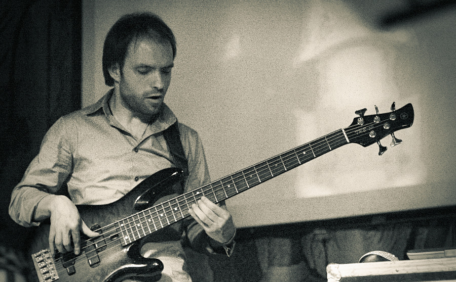
Before we proceed to the heart of the matter, let’s have a look at this little lad. He’s like saying to us: “I couldn’t care less about the so called photography of yours and yourself. Go away!”.
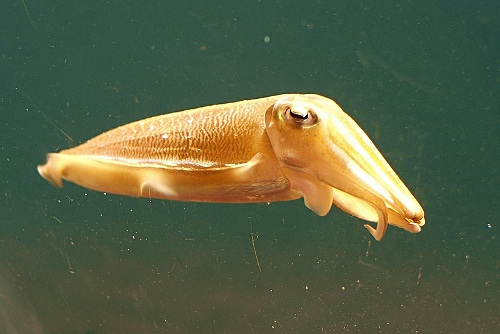
Common cuttlefish
While common cuttlefish (Sepia officinalis) is indisputably cute and photogenic, the irony is that it had been subject to a lite form of genocide for decades. It started with German painter Jakob Crescenz Seydelmann in the end of 18th century who discovered how to make a really rich tinted pigment out of the ink sac of the common cuttlefish. The pigment got its use in watercolors and oil paints, and a century later — in photography.
As a matter of fact, sepia toning wasn’t done just for visual effect. The thing about sepia is that the chemical process involves replacing the metallic silver in the emulsion with silver sulfide which is a lot more stable than metallic silver and thus preserves “printed” pictures a great deal better. Which is exactly why we can see that many samples of early photography around.
The next special thing about sepia is that during the process it starts replacing lighter areas first, because they are less exposed and thus have less metallic silver. Thus in order to get a richer tint photographers do the so called bleaching which basically means washing out metallic silver.
So in analog photography classic split toning is what you get when you bleached a picture and processed it with sepia. That way you get tinted highlights and midtones, while shadows are mostly preserved. This is exactly why in many examples of split toning you can see a lighter shade of brown used for highlights by default — so that you get look and feel of traditional sepia toning.
An important thing to remember is that sepia is not the only toner. Another popular toner is selenium which is different from sepia in a way that is starts processing from shadows (and tints pictures with purple). Today you can get all kinds of toners which you can combine.
With digital pictures used all around the demand for long archiving of new printed photos is rapidly going down, and split toning is now usually understood as a way to make pictures look old. So many, many photo editing applications have a sepia effect activated with just one click. For GIMP users split toning is very easy to do thanks to Stanislav Nepochatov who created a script called Split Studio. This script automates split toning, while providing additional fine control over the result (better than a Photoshop action, in fact).
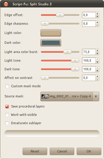
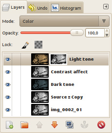
Split Studio dialog
The script actually comes with a user manual that explains every single option, so there’s no need duplicating that effort. Instead let’s have a look at what exactly it does and how it maps to traditional split toning.
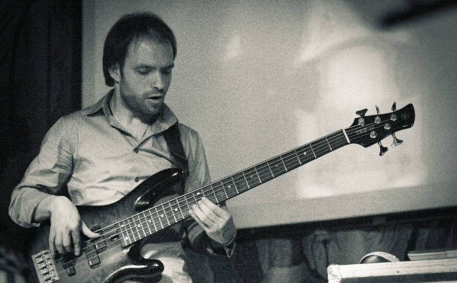
Let’s use this picture as example:
Source image
(Not that it’s the best example for split toning effect, but you can’t get anywhere without an example, eh?)
The very first thing that the script does is checking whether you told it to desaturate the original image. If you want a true split toned picture, you need desaturation, not only because original sepia toning works on b/w photos, but also because as soon as you start tweaking opacity of dark tone and light tone layers, the original color image will start shining through. Make sure that you really need it before you say “no” to desaturation.
The next thing it does is creating two layers: “Dark tone” — for shadows, and “Light tone” — for highlights. Also, if you defined “Contrast affect” as anything higher than default 0 value, a b/w version of the original image will be added as “Contrast affect” layer in Overlay mode on top of “Dark tone” layer. So if the so called photographer didn’t bother fixing contrast first, this can be done at this late stage. The result can subjectively improve the look of an image.
Just for the sake of comparison here is split toned version with “Contrast affect” = 0:
Not boosting contrast
And here is split toned version with “Contrast affect” = 70:
Boosting contrast
The next step for the script is to use b/w representation of the original image as a mask for the “Light tone” layer, followed by colorization of each of the tone layers.
Now you might ask a question, what that mask is for. Let’s apply it via right-click menu above the layer (or using Layer > Mask > Apply Layer Mask menu item) and “solo” this layer by Shift+clicking on its eye icon in the Layers dialog:
Applied mask
If you ever studied basics of using masks, you know very well that white means full opacity, while black means full transparency, and everything between them makes 254 transparency/opacity gradations. Hence by attaching a mask that contains the original image you tell GIMP to remove all shadows from this layer and leave mostly highlights and midtones that will be tinted. Which is exactly what real sepia does.
Next the “Light tone” layer is processed with Hue-Saturation color tool controlled by “Light area color burst” slider in the dialog. This slider actually does what bleaching in the real chemical process does. If you try dragging the slider to the left so that the value equals to zero, you will get a picture where highlights and midtones are barely affected by sepia:
Min highlights processing with sepia
Finally, all tone layers are set to Color blending mode and get some opacity value, controlled by “Light tone” and “Dark tone” sliders. If you enable the “Save procedural layers” checkbox, the script won’t flatten all layers and will preserve all the intermediate layers it creates so that you could tweak things like opacity of tone layers, the mask of light layer etc. Here is what the layers composition will look like:
Layers composition
By default the script provides very pleasing results that, however, are strictly speaking not traditional sepia toning, because sepia has a somewhat richer brown color. Which colors you choose for highlights and shadows is entirely up to you.
Now, fiddling with layers and masks and whatnot can be fun, but being able to re-edit a picture without saving XCF sounds like a nice idea. Is it doable? Yes, if you have darktable around. While proper introduction to darktable is still due, let’s have a look at how its different plug-ins make split toning not just possible, but actually fun.
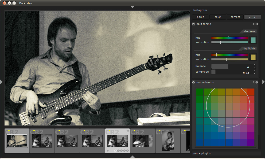
For darktable everything starts with desaturation which you can do two ways: via channel mixer plug-in or via monochrome plug-in. This is a very important step, because the way you desaturate defines a lot of the look and feel of a split toned image, since true split toning generally works on shades of gray.
In fact, every plug-in that changes colors or controls distribution of tones in the lightness channel will define the look of your picture. This is because darktable has linear pipeline: a source image is passed from one plug-in to another in a fixed order, so before we get to actual split toning, the image will pass exposure, tone curve, zone system, color zones etc.
That gives you plenty of options to adjust global effect (exposure) and then do finetuning (the rest). Darktable wins hands down here, because unlike GIMP with its 8bit per color channels precision and thus only 256 grayscale gradations it works with 32bit per color channel precision, and thus has plenty more shades of gray to abuse.
Channel mixer is really a tool with a more finegrained control over the result. The principle is the same that you know from GIMP or Photoshop: you define how much red, green and blue channel contribute to the output channel which in case of b/w photography is gray.
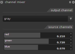
Color mixer in darktable
Monochrome plug-in is more simplistic, but in some cases it’s actually preferable. What it does is desaturating your image and applying a color filter on top of it, as if you shot a picture with one on top of your lens. The size of the circle can be controlled by mouse wheel scrolling, and repositioning is done by simply dragging area inside of the circle around. It takes probably a minute or two to get the feel of the tool.
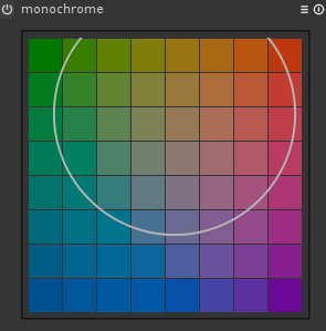
Color mixer in darktable
While adjusting split toning options, you might find it necessary to adjust channel mixer of monochrome options, or even options of some other plug-in that sits before split toning in the pipeline and contributes to the whole effect. This is where darktable shines again in comparison to GIMP: you can re-adjust any options any time you want. Just switch to that plug-in and change things. You can always undo or even temporarily disable the plug-in by clicking the power button to the left of its name.
So, split toning options.
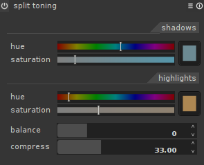
Split toning in darktable
The idea is more or less the same: you choose one tint for shadows and one tint for highlights. If you don’t like dragging sliders, you can click on the preview square. That will give you a very typical color picker:
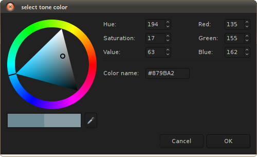
Tone color picker
The two other options are Balance, which defines, whether shadows tone or highlights tone gets a larger share of tonal range to tint, and Compress, which defines how much tinted shadows and highlights there will be. You can understand Compress option as uniform saturation control over shadows and highlights.
If you use the very same tone values from default values in the Split Studio script, you will find out that the picture look really differently. One of the reasons for that is because darktable won’t tweak highlights using Hue-Saturation tool. You can, however do wonders with color zones plug-in.
A rendering similar to GIMP’s will look like this:
GIMP-like rendering
Until darktable has masking, you won’t get exactly the same result (and you don’t always need to), because the GIMP processed version actually uses layers and masks to blend exposures before applying split toning. Sorry :)
Last thing to mention is that default values for split toning plug-in look a lot like selenium toning, and probably intentionally:
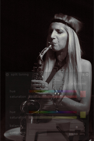
Selenium-like toning
Finally, let’s get back to our beloved cuttlefish. According to Wikipedia, a 2008 study on common cuttlefish revealed that cuttlefish embryos, if visually exposed to a certain species of prey, will hunt primarily for that prey in later life. Which means that while nowadays photographers tend to use sodium sulfide based toners, not mentioning comparatively harmless software, they still should be careful. Cuttlefish never forgets.
Cuttlefish photo by: OpenCage.info
Patreon subscribers get early access to my posts. If you are feeling generous, you can also make a one-time donation on BuyMeACoffee.