I wrote this tutorial, because readers of my blog were interested in a technique I had to invent rather out of despair to accomplish a real-life task. The technique uses a combination of raster and vector graphics. Presumably you have a very good understanding of GIMP and Inkscape features.
Here is what I had in the beginning:
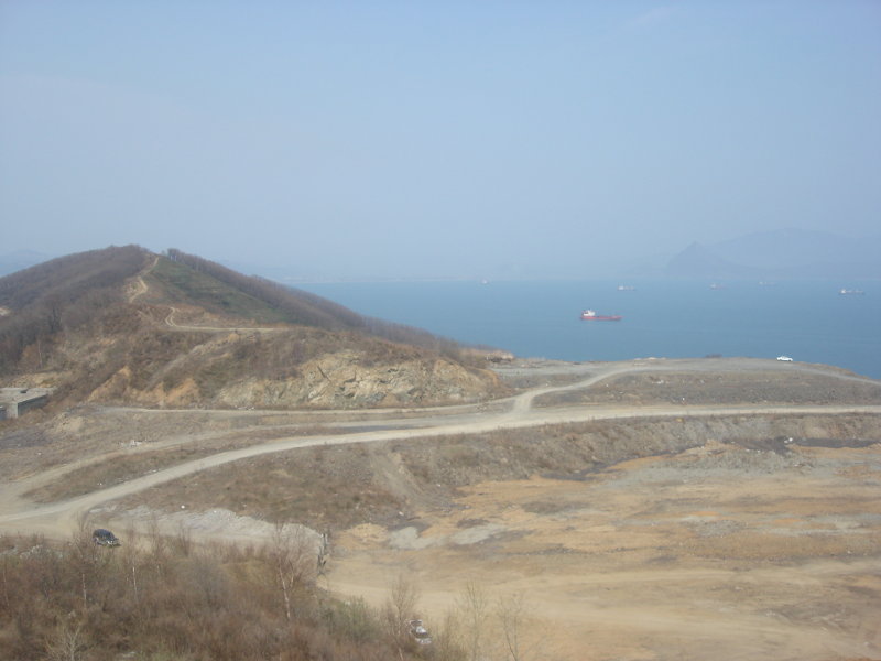
So, quite a dull picture taken with a point-and-shoot camera: noon daylight, haze, boring scenery. What we need, however, is: bright and buoyant landscape with a light touch of conventionality. And we need it fast. So let’s combine speed and simplicity of vector graphics with detail of raster graphics.
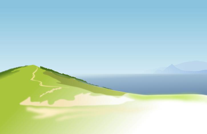
Import the picture to Inkscape. Carefully draw the background over the photo. For the hill use a path of fresh green color falling off to white color. Now move away the photo:
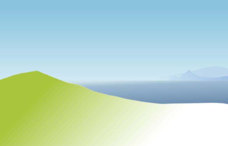
Boundaries of the background are slightly blurred to give the background an out-of-focus feeling. The foreground is blurred even more, because we are not going to leave it as is :)
Now it’s time to add details from the original photo. Open it in GIMP and remove color by using Color > Desaturate tool. Use Curves tool to lighten the image and increase contrast. Erase details we don’t need like ships on the sea and foreground object that will be covered by white color.
Now it’s time to add alpha channel to the layer. Go to Layer > Transparency > Color to Alpha and use white color (that’s default value) to creat transprency based on white color.
In Layers palette lock transparency, pick a dark green color and fill the whole layer with it. Here is what you see in the end (I’m using white background here, but in GIMP you will see checkerboard of course):
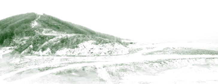
Why make it so difficult instead of usual colorization? I didn’t really measure, but subjectively Colorize tool doesn’t create a visually monotonous image, while fill over a transparent layer does.
Now place the resulted bitmap (saved to a PNG file) over our vector drawing. You don’t need to try hard matching the objects: top of the hill isn’t there on the drawing anyway. But it looks good enough, so leave it as is. This nonchalance rather encourages a sketchy feeling. Bottom of the image that was carelessly erased in GIMP can be overlaid with a blurred white closed path to make the drawing coquettishly unaccomplished:
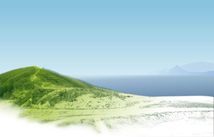
Hey, that looks like a sunny spring day already! But the picture is somewhat monotonous. So let’s make large color blotches really stand out: the pale rockslide — with blurred paths, the road — with strokes using Callygraphy pen. You don’t even have to try drawing exactly over road’s edges. Just do sever rough oil pastel strokes. Make the grass greener, the shadow part of the slope and the forest — darker. This all is, again, below the bitmap image.
You can barely go out of fingers counting vector objects. Being rough, they somehow make the picture look better than in real life. Especially if you draw light and dark callygraphic strokes over bitmap tree trunks. And you can add touch-ups to clouds in the sky:
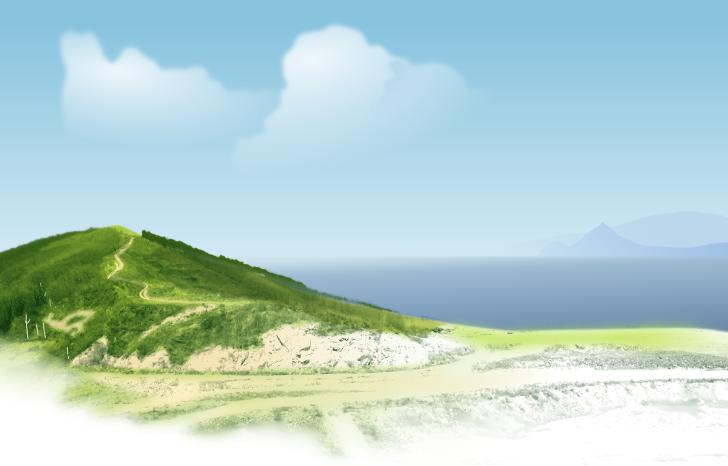
Further refinements are a matter of taste and the task to accomplish. However you have to agree that the first and the last images are a far cry.
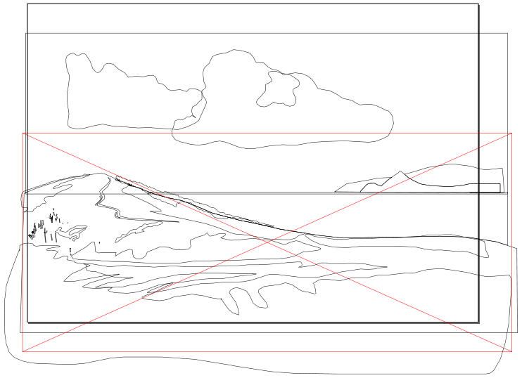
So all it takes is several easy manipulations in GIMP, and as for the vector part… Here it is:
Patreon subscribers get early access to my posts. If you are feeling generous, you can also make a one-time donation on BuyMeACoffee.
