One of the difficulties with artists is that people who do real work with free software rarely mention it. At some point they reveal it though, which is how I got to know Ollin Boer Bohan.
Last year Ollin presented himself on the gimp-developer@ mailing list and was later interviewed by GIMP’s UI team to learn more about his icon design workflow.
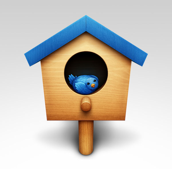
Twitter Birdhouse
Ollin is an OS X user with a very old iMac, so he’s one of those rare people who actually got the grip on X11 based version of GIMP and made it his tool of choice, professionally. He also uses MyPaint and Blender.
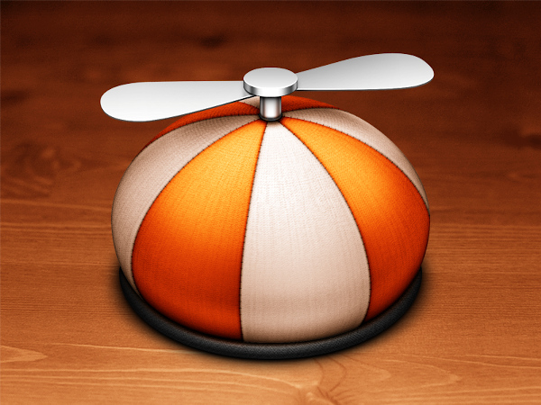
Little snitch
As you will see, there’s quite a bit of wood, metal and glass on his high resolution icons. And yet Ollin manages to do his work without too much skeuomorphism and with just the right amount of humor. Here’s a chrome cookie, with a bit of meringue :)
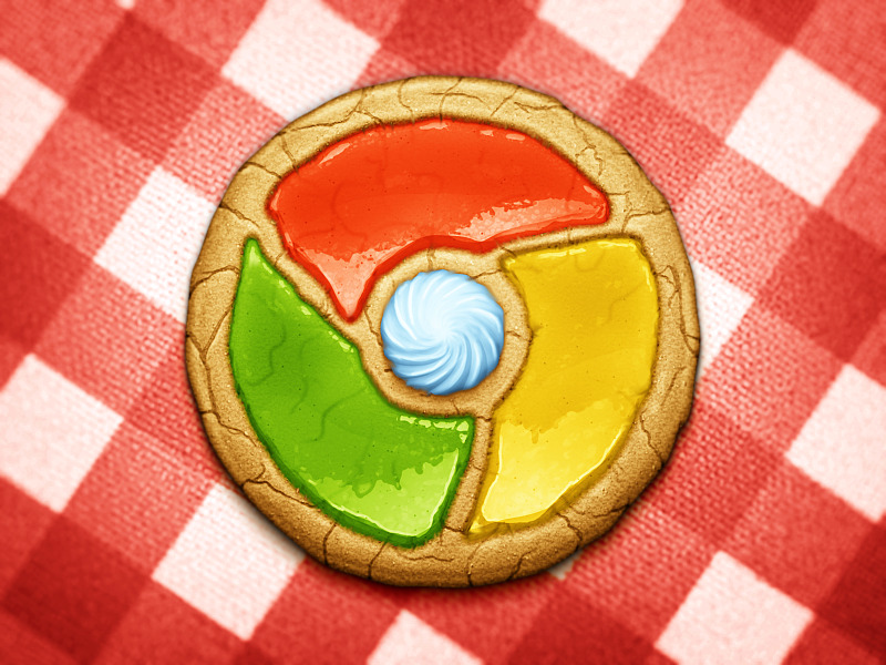
Chrome cookie
As already mentioned above, Ollin makes a great use of both MyPaint (for sketches), Blender (for 3D elements) and GIMP (for pretty much everything else). Since he uses OS X, he’s made icon replacements for several of these to match the high-res default set. Here is one for MyPaint:
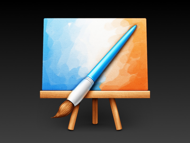
MyPaint
Another free application that got an unofficial icon from Ollin is “The Battle for Wesnoth”, a turn-based strategy game.
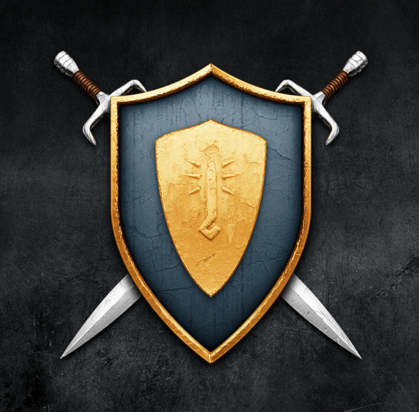
The Battle of Wesnoth
Why unofficial? Ollin hasn’t yet contacted the teams regarding his artwork. He explains:
Most of these projects already have vector icons, and, although they aren’t as glossy/realistic/vibrant as mine, they can be scaled up easily by the team for banners, posters, etc. Since my icons are made in GIMP, which is entirely raster [sadly], I doubt they would have much use for them.
Nevertheless, pretty much all app icons are available in .icns, so teams are encouraged to make a use of them if they wish.
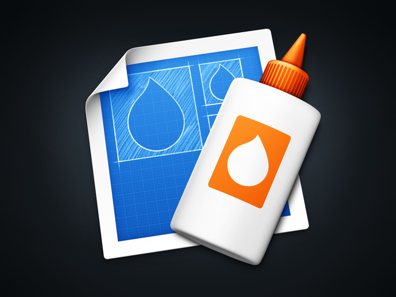
Icon Composer
Some of his icons are made to replace the icons for Apple’s programs. Here’s one for Applications:
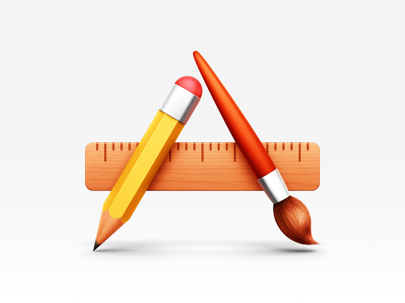
Applications
He also redesigned the icon for Safari, because he “disliked the gratuitous gloss, nonsensical reflections, and general datedness of the default icon”. The new one, in his own words, is a minimal and elegant design using the original great concept.

Safari
And the one below is a replacement icon for Apple’s Preview. Ollin says he tried to make something clean and light, like the program, but with some beautiful photorealistic details, e.g. reflection and distortion of the glass.
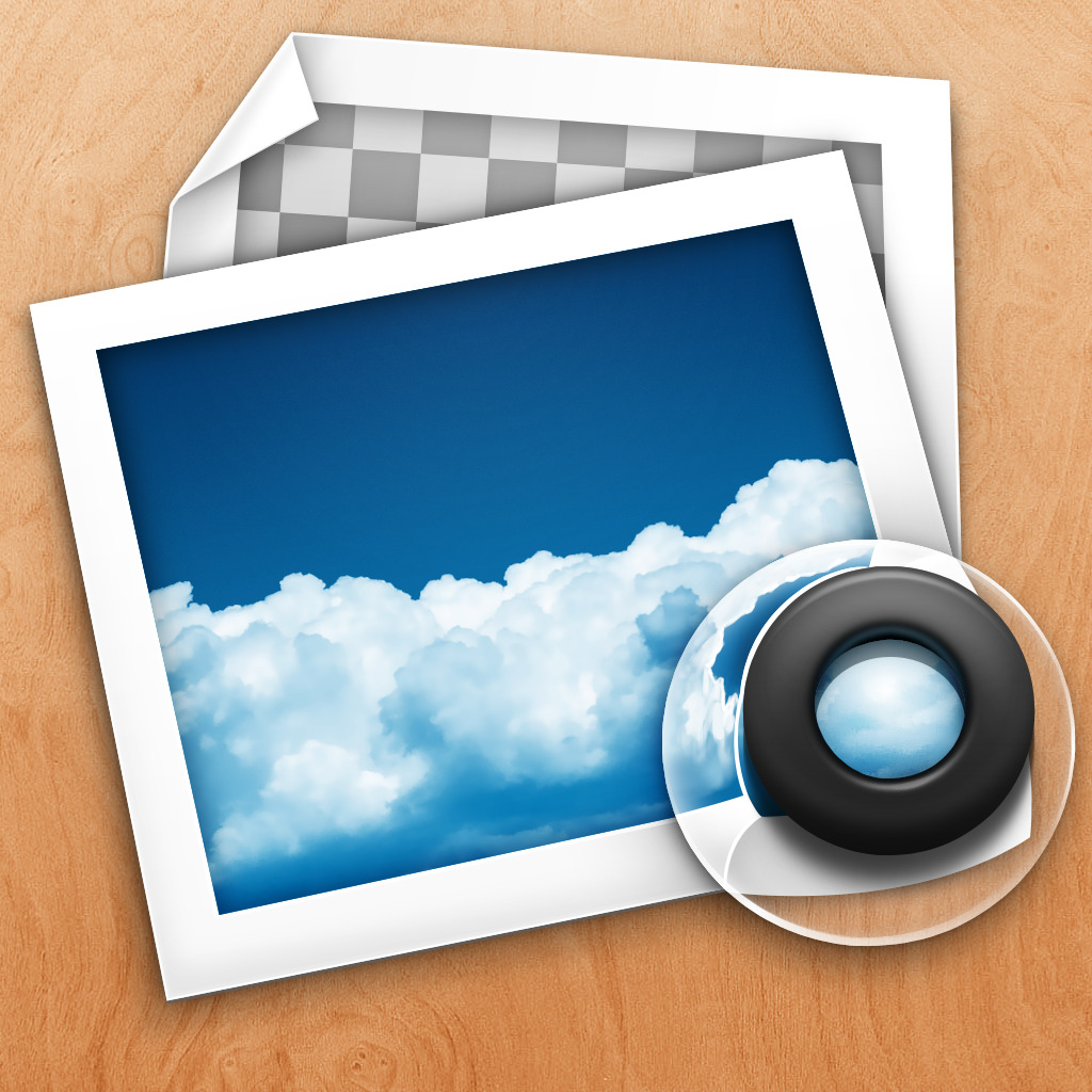
Apple Preview
Ollin has two active online portfolios: one on his website, and another one at Dribbble. The former is a select, tightly curated gallery of works, the second is a window into whatever he is working on at the moment.
Having said all that, if you are a designer who uses free software such as GIMP, Inkscape, Scribus or Blender for your professional work, please consider mentioning it online every once in a while. While Blender has tons of showcases, the former three apps would do with some more.
Patreon subscribers get early access to my posts. If you are feeling generous, you can also make a one-time donation on BuyMeACoffee.
