Dancing Tango on the Desktop
Disclaimer: The interview was originally taken for linuxgraphics.ru, and this English version was published in GNOME Journal.
When we are talking about software, we often go into technical details and forget that a desktop is for people, not robots, and thus it should be visually appealing and consistent looking.
Consistence is a matter of not only following human interfaces guidelines, but using a partucular visual style throughout desktop as well. In the UNIX world we have several major efforts to provide means for such a desktop.
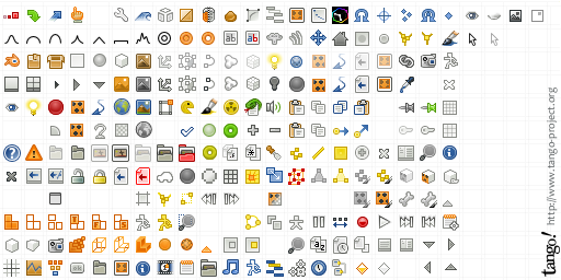
One of them is Tango project that gives us an icon style guideline, an icon naming specification and an icon theme based on it.
In the days of its genesis several unification projects like RedHat’s Bluecurve already existed. It was Steven Garrity who suggested to work together in his historical email to Red Hat and Novell representatives and several individual artists.
It took participants almost a year to get things straight and in October 2005 on annual GNOME summit in Boston Jakub Steiner and Steve Garrity announced the Tango project.
Let’s talk to two of most active contributors to the project — Jakub Steiner and Andreas Nilsson.
Please introduce yourself and tell us about open source projects you were/are involved into with regards to design.
Jakub Steiner (further as J.S.): I’m a 31 year old graphics and interaction designer at Novell. The project I have closest relation to and you could say am passionate about is GIMP, where among other minor contributions I designed the icon set for both 2.0 and the upcoming 2.4 version.
In terms of amount of work, my blood and sweat went to OpenOffice.org and GNOME. As it’s impossible to help every cool free software project I ever come across, so I pick the ones that I use every day (F-Spot, Banshee, Totem).
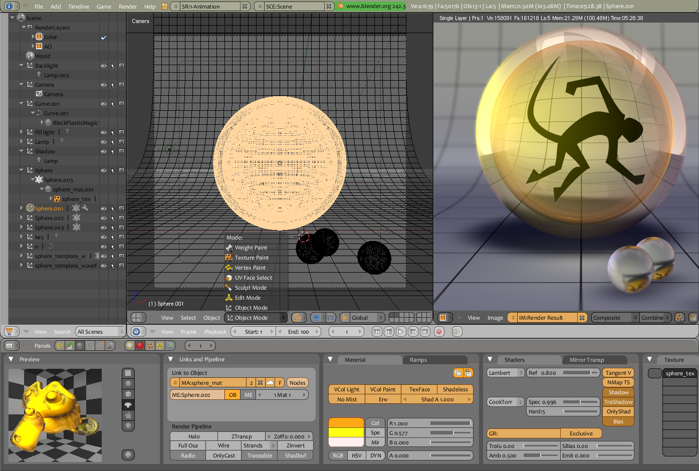
Projects I depend on include Inkscape and Blender, but the communities around those projects are very healthy and until recently I didn’t focus on helping there much, even though I felt I ought to. But then I saw custom icon themes support coming and created a Tango styled set of icons for Blender.
At Novell I’ve been responsible for the visual side of our SLED10 product and recently the openSUSE 10.2 branding (excluding icons). I’m also member of the Product Design team responsible for functional design of things like the Beagle search tool and the main menu (SLAB) to pick a few.
I’ve also turned a father recently, which takes up more time that I have imagined. I used to get a lot done during the weekends, which is almost impossible now. On the other hand I’ve learned some useful skills.
Andreas Nilsson (further as A.N.): My name is Andreas Nilsson and I’m a 24 year old dude who lives in Gothenburg, Sweden. My first involvement free software project was when I did some images for a little GNOME applet called glunarclock written by a friend of mine, Debian developer G?ran Weinholt during high school. Since then I have been working on Freecraft, Open Clipart project, Inkscape and a couple of other projects.
I’m currently making icons for the GNOME desktop, Scribus, Jokosher and a couple of commissions for some clients that is not yet announced.
There were quite a lot of complains that GNOME HIG color palette was dull and lifeless. You now seem to have successfully solved this with basic tango color palette. Do you think that HIG palette will be changed in the future?
J.S.: Dull for some, elegant for others. I consider the old GNOME palette very appealing and something pleasant to look at every day for years. However, the goal of the Tango project was to ‘fit in’ with the rest of the world. And since everybody is steering towards saturated and vibrant colors we had to do the same.
An important aspect of the Tango palette is that we keep things simple. It’s only the very basic colors we wanted to define. It’s not hard to mix colors or shift lightness to get highlights and shadows. The palette is a starting point, not something you have to index your images to.
Having HIG updated (in many areas) would be desirable. Some ‘use tango’ patches for many places are due, indeed.
How does the process of designing and polishing an icon look like for you? What tools do you use?
J.S.: In the very rare occasion when I design an icon from the ground up, I start with a paper & pencil sketch. Even if you aren’t completely confident with drawing, a quick sketch will tell you whether a metaphor will work or not. If you cannot easily tell from a pencil sketch, you rarely can make up for it digitally.
Then comes up the vector editor and a lot of iteration to have the shapes look natural and smooth while keeping the icon look crisp by aligning to the pixel grid of the target resolution (more about this later).
Then depending on the shape and complexity I either use the same vector artwork for the smaller resolutions, getting rid of detail, aligning to the grid or render the artwork into a bitmap and fix it up GIMP. Most of the tango artists use a vector editor all the way. I guess I’m old (-school).
A.N.: I usually sketch stuff on paper first, trying out different ideas and compositions. When I’m happy with a design I start drawing it in Inkscape, often starting with a smaller size, like 22×22, so I won’t get lost in details and don’t don’t something that is to detailed and will just look messy in 16×16.
In order to make sure all lines get sharp, I often export the SVG to PNG and edit it in GIMP. During the process I bounce the work back and forth with my client (when doing work for hire) or with the other artists in #tango on IRC.
What old and new features in Inkscape and GIMP (or other tools) do you find most useful for icon design?
J.S.: I love when a tool allows me to keep my focus on the canvas. Inkscape has a nice selection tool allowing to select overlaid objects, even if they are part of a group. Right on canvas, no mouse movement marathon happening. Nice and precise keyboard control for object transformation and node editing.
I’ve been using GIMP for icon work for the past 6 years. So even if all I do is pixel paint with a semi-opaque brush all the time, it’s just a natural tool to me now. I can lower the opacity of a brush, change brushes with a mouse wheel and a modifier key. One hand on the keyboard, the other on the mouse and the eyes on canvas. Nothing fancy, just damn efficient.
A 1:1 view on my LCD screen, the zoomed view on the CRT screen makes it both precise to draw while providing an overview of how the things look in the end. Drawing 16×16 pixel icons is a bit of a guess work. You click somewhere to check if the illusion of creating a detail works on the 1:1 view. A single pixel is sometimes all you need to change to get a certain detail right.
A.N.: I don’t think it’s the number of features that makes a application great, but the fact that it’s well designed and gets the job done without to much crap in the way. But if I get to name the one feature I find most useful in Inkscape I must say it was when they added the px unit a couple of versions back. Being able to produce sharp outcomes is crucial to me. I also find the palette at the bottom and the gradient-on-canvas tool quite nice.
It’s not a big surprise that desktop art for UNIX is still created using proprietary applications in some cases. If you did a switch from proprietary applications (which ones) to open source applications for design, what made you do it after all?
J.S.: With GIMP, sometime during 1998/99, it was simply not being able to afford an Adobe Photoshop license. I’ve been exposed to the magic of Photoshop at the university of Huddersfield and I wanted to find an alternative editor to create artwork for the hip thing called WWW site
I’m very happy that Adobe chose to charge so much as the search for alternatives drove me to Linux as GIMP didn’t run on the Windows platform. I learned about the free software movement and enjoyed the freedoms, mostly to run my applications on a platform I choose. And web development was so much easier on Linux that time (well I bet it still is).
I have waited a long time to be able to replace my Illustrator 9 copy with free software. Sketch, Sodipodi were projects I have followed with hope, but ultimately it was the Inkscape folks that created an artist-centered illustration package. Inkscape has an incredible feature set that make it a brilliant generic illustration package. I still lack being able to node edit multiple objects and do perspective transforms for my icons, but overall it does what I need.
The big ‘downside’ with free software tools is that there is a huge temptation to run the bleeding edge versions of software. You can run the latest bells and whistles the developers are working on. A wise person would not consider driving a prototype car to work every day, which is sadly what I’ve been doing for the past few years.
People expect the release to be stable, but that can hardly happen if there are no ‘beta’ testers. So being a test-sheep is part of my contribution to some free software projects too.
A.N.: I started out with digital graphics when I was fourteen and used Paint Shop Pro, as it was bundled with some computer magazine I read at the time and was using that for about 6-7 years or something. At design school we were trained in the Adobe Suite (Photoshop, Illustrator & InDesign).
These days I use a combination of GIMP, Inkscape and Scribus and the biggest difference between those and the Adobe Suite is that Adobes applications works better together with each other and behave similar and is therefore easier to learn.
The thing that made me switch is partly because I couldn’t use those on my Linux-only computer and partly because I don’t like using non-free software. I’ve always been interested in trying out new, cool stuff with computers, so GNU/Linux looked like a nice thing to try out. However I did have a dual-boot system for a long time.
Do you think something particular could be done to make GIMP, Inkscape and Scribus be better integrated?
A.N.: Several things. One is using the same icons — an issue that I’ve been working on with the Art Libre Set. Another would be similar ways of dealing with layers. Jon Cruz told me that it wasn’t by accident that the layers window in Inkscape behaved similar to the one in GIMP.
It would be great if Scribus developers did the same, unless they find it counter-productive. But it would make it easier to learn tools. The layers dialog is just a small example. For Scribus, having the Node tool behave similar as in Inkscape would benefit learning the interface a lot too. From what I know they plan to address this issue after porting to Qt4.
Another cool thing with the Adobe suite is that it’s a charm importing the different formats into the different apps, like inserting Illustrator files in InDesign, Photoshop files in Illustrator etc. And as I understood, the devs of Inkscape, Scribus and GIMP are making similar efforts, and doing a fine job at it.
How did you come to idea of Tango Fridays and how far are you ready to go with it (non-GNOME applications)? How exactly do you redo “fuzzy” icons?*
A.N.: We figured we needed some day where we could devote a whole day to get together, chat to new contributors and stuff like that as we’re all pretty busy during the rest of the week and Friday sounded like a nice day. The fuzzy icon issue is about using a icon for a resolution it’s not intended for, like only having a 48×48 image, where the menu for example demands a 16×16 icon.
J.S.: Keeping people motivated all the time, especially when most of us are volunteers, is hard. Tango Friday is a semi-regular event where we hang out on IRC and ‘hack’ on icons for various free software projects. Obviously we follow the “guidelines
Fixing up fuzzy icons is nicely demonstrated in this small cookbook demo, taken directly from the style guidelines. Alternatively you scale down the artwork in Inkscape with the stroke width unaffected by the transformation, take out all the tiny details, turn on the grid and make sure the lines snap nicely to it. No artistic skill required whatsoever.
Jakub, in your recent blog entry you were talking about vector and bitmap icons again. While you say that using vector icons as is makes sense for high resolution displays only, SVG files are still provided in many icons themes (including Tango and Tango based icon themes). What could they be used for?
J.S.: Having icons assets created in vectors has many advantages to the individual artist or artist community. Vectors are much easier to modify, create derivative icons and reuse for other purposes such as printed brochures, splash screens and other marketing/promotional work.
Some people think that they also help in that they are resolution independent and a single artwork can be rendered to any size. It’s a very tempting prospect, but similar to fonts it’s problematic at small resolutions. Vector fonts solved this by adding hinting information.
Instead of creating multiple bitmap fonts, an artist designs how a curve should deform at certain resolution to provide readable and crisp bitmap. Projects like freetype managed to implement something called auto-hinting that manages to deform the curves to align to the grid automatically, without requiring the font author to design such hints.
Combined with anti-aliasing this solution gives good-enough results. I’m not aware of any similar technology for generic vector artwork though.
Even if vectors are good for high resolution, it doesn’t mean it’s more efficient to render the icons form the vector source at runtime. Some argue that the artwork is so complex that it’s both more CPU intensive and requires more memory/file space to handle than bitmaps.
A.N.: It’s not pixel-vs-vector, it’s about using pixels where it makes sense and vectors where it makes sense. The nice things about vectors is that you can blow them up as big as you feel like without getting big squares on the screen, but in a lot of cases I don’t need to blow the icon up, but I need them small and crisp in a way I can only get them with a bitmap editor (and remember that we are using pixel monitors, not vector monitors). Don’t use SVG because it’s cool, use it where it’s needed.
Sometimes, when technologies make another shift, it’s difficult to find a proper sign for an action. It’s the same problem for new notions. For actions the best example, IMO, would be a much controversial icon for “Save” button (which used to show a floppy disc before). How do you handle cases, when something new has no existing widely recognizable sign yet?
J.S.: The key thing here is that the icon should help the user to navigate in the interface, help to understand or find certain functionality faster compared to having a simple text label. There are indeed cases where an generally acceptable and obvious metaphor doesn’t exist.
Many developers don’t take no for an answer, but sometimes it really is better to have no icon at all than a non-obvious one. The mac can live without menu and button icons and is believed to be closest to an ideal of a well designed usable desktop.
Inkscape is an excellent example of icons losing their primary function. Pretty much every single item in Inkscape’s menus includes an icon. Regardless of how often used function a particular item is, or whether it’s a unique in shape and communicates the functionality well, the menu is overpopulated by pretty colored pixels.
I do love creating icons for their visual appeal. They are tiny artworks. But people’s desktops is not a gallery showroom, a medium for artists, they are people’s work tool. Icons should be primarily usable.
Good icon design is about not losing the essence while stripping as much as possible. Every large project requires compromise to be made, and there are many forces playing against good icon design. Product marketing wants icons to carry branding, almost everybody wants their application to look ‘spiffy’. That’s why you get OpenOffice module icons have all a poor silhouette to make them appear coming form the same ‘family’. The branding defeats usability.
Similarly, some metaphors become recognizable for some audience simply by familiarity. As you mentioned, people aren’t using floppy disks anymore, but the ‘save’ action is still the most widely used metaphor. The case with the save icon you mention is controversial because it’s hard to tell whether the familiarity with existing icon should take precedence over a new metaphor.
The decision has been made to go with a more future proof solution for the save icons as there are actual young users that never used a floppy in their life. We think the time has come to let the floppies rot in time. But that doesn’t mean we want to turn our back to the legacy metaphors in all cases.
A.N.: Good metaphors are hard. You have to consider what your target audience will expect and what they will be familiar with. If you’re making a application for photographers, you need to use concepts and metaphors familiar to photographers, hence the strong use of dark-room metaphors in GIMP for example.
I think it’s important to be brave where you can when designing interfaces and remember that the interfaces that made sense when designing the Xerox Star might not make sense today.
Some people believe that a true masterpiece can be a work of a single person only. Do you think there really is a problem like collective creative work vs. creative work of a single artist, especially when in Tango project icons are sometimes/often finished by not its original designers?
J.S.: Tango project doesn’t really aim to create a masterpiece. It’s all about getting a consistent user experience with the least amount of work.
There are many great icon styles out there. What many developers and users don’t seem to care much about, but makes an artistically inclined person shudder is visual consistency. You may like vanilla ice cream and love hot dogs, but eating them combined will raise some eyebrows (and possibly test your gag reflex). What does it matter that you have a brilliantly executed Gorilla styled icon when everything else is following different style. That screams ‘unpolished product’ to me.
With GNOME we kept things consistent by essentially only working on icons in a two man team, keeping everything centralized in the gnome-icon-theme module. There is a better way to achieve consistency though — to provide a style guide, a cook book, so that other artists can create their own artwork that looks consistent. I think this worked much better. It’s better if a project can take care of its own artwork rather than relying on somebody else to fulfill their needs. It also solves the problem with 3rd party developers/ISVs.
It’s much more sane to provide a gudeline to ISVs to handle the artwork themselves than living a fake dream that we’ll have enough resources to theme every app in the world. It’s a similar situation to getting applications work together/interoperate by either writing them all yourself (Adobe Creative Suite) or by defining open standards and formats (WWW).

After being confronted with hacker-made XPM artwork in the past I had my doubts about losing up the control, but in fact it turned out defining the style explicitly and opening up the artwork ‘development’ a much better way to achieve consistency. We have a lot of very capable artists contributing artwork to plenitude of free software projects. This has been a huge win for us and I’d like to thank all the great contributors.
A.N.: I think that it’s important to draw the line between interfaces and art. What we are doing is not paintings that are going to be hung in galleries, but parts of interfaces that are going to be used by people for getting work done, just like any slider, dropdown menu or pushbutton. Therefore, I don’t really see the problem of several people working on a single icon, if I start something and later on someone else does something to make that better (like changing color, fixing the shape or something similar) it’s a good thing.
I think it’s the same thing with fonts: DejaVu for example are worked on by a whole bunch of people, even though traditionally typefaces have been the work of one author.
You already mentioned Art Libre Set icons subproject. When you started it, you were taking into consideration a typical bitmap editor, vector editor and a non-linear video editing application. Now that Andreas has already contributed to both Scribus and Jokosher, are you going to extend the set to a “typical” desktop publishing application and a multitrack recorder? Any other additions to be expected in this subproject? How exactly will this set be distributed and reused in applications?
J.S.: The drive behind the art-libre project was to a) define common metaphors for tools that did essentially the same thing and b) create a common library to reduce redundancy. I bet you have seen projects that aim too high and lose steam on the way, never getting anywhere. Even though I still think it’s a good thing to keep the idea alive, it’s going to be easier to focus on the first part initially. Even if the artwork isn’t re-used at runtime, it’s still reusable in terms of graphical assets (most of the time, granted the licenses are compatible).
It turned out providing individual projects with artwork has a lot less friction than trying to make all the developers build lots of code to share a common art library. It’s still a worthwhile goal to get even to point b), but we don’t want to live in a vacuum in the meantime.
A.N.: The idea of Art Libre Set came up because if you look at GIMP, Inkscape and Scribus, you see that a lot of tools are similar and use similar icons (like the gradient tool, or pen-tool), so instead for them to install those icons 3-4 times, the applications could share them (and that makes my job quite a bit easier, as I only need to keep track of one, instead of four icons). It would be cool if more applications could share resources in a similar way, so having Pitivi, Diva and Jokosher share a similar library would certainly be possible. Myself, Edward (the Pitivi maintainer) and Jono (the Jokosher maintainer) has been meaning to discuss this, but haven’t found the time yet.
What other subprojects are going to tango on the desktop floor? :)
J.S.: Apart from the app icons you see are being done during the Tango Fridays, a lot of work goes into fixing up OpenOffice. Just like GIMP or Scribus, OpenOffice is a multi-platform application that will benefit from a tango-style stock. GNOME is also getting a Tango face-lift.
A.N.: I’m currently working on application-specific icons for some projects and trying to finish up A-L-S, but who knows what’s coming up. Like you said, I redesigned some icons in Scribus.

But I’ve been working on Tango icon theme for Inkscape for quite a while:

What happened to releases of the icon theme? The last one was uploaded this summer.
J.S.: There hasn’t been much happening on the tango base theme for a while now. The thing to understand is that the base theme isn’t as important as people seem to think. Tango project is not about providing an icon theme that will cover every action and status icon on the desktop. Tango project is about providing a style for developers to make their application look ‘native’ on the Linux desktop.
GIMP, Scribus, OpenOffice.org, GNOME are projects that have their icon follow the style guideline currently. Having GTK+ stock updated would be something I’d love to see happening soon too.
Tango base has been a great testbed to see if the goals we laid out in terms of ‘visual-interoperability’ would actually work. But the important thing which is happening now is that application developers follow the guidelines for their projects.
Do you contact to designers of other icon themes, especially Oxygen?
A.N.: Yes, I usually hang out in #kde-artists on irc.freenode.net and chat with the Oxygen-dudes from time to time, although I haven’t met any of them in person yet, as we haven’t been able to make it to the same conferences, although I hope David, Ken or Nuno can make it to the next Libre Graphics Meeting.
J.S.: I do know some of the people in the Oxygen project. Kenneth Wimer, who worked in Novell with us, was in fact one of the founding members of the Tango (Unify back then) project. David Vignoni is an excellent artist following the footsteps of another great KDE pixelpusher, Everaldo Coelho. Both of which I’ve only been able to get in touch by electronic means, but are excellent and inspiring artists. The goals of the projects differ, but there is common ground in the area of naming and metaphors. Meeting in person always helps, so getting together somewhere like the Libre Graphics 2007 would be great.
Do you think that cooperation on any level is possible?
J.S.: The Oxygen guys seemed rather positive about cooperation on the naming spec and defining the common metaphors, but nothing concrete has happened there yet. On one hand it’s sad to see fragmentation of people resources, but it’s idealistic to think that if people stopped hacking, say, on Krita, GIMP would move forward faster.
Oxygen people don’t have the same goals and don’t aim to fix the problems we think are hurting the Free desktop. Their goal is to make a spiffy new KDE icon theme. They see a unique look is a good attribute of an icon theme that separates and defines them from the rest. They don’t seem to consider that users tend to run applications coming from various projects and the resulting style mish-mash a problem.
We took a look at this from the 3rd party developer perspective and figured out it’s not a good thing to suggest they ship two different sets of artwork. Defining a common style that works in both environments seems to be least work. And being lazy ourselves we knew it will benefit them when the same stock looks decent on Windows and Mac OS.
One of the reasons we started talking about finding common ground way back at the NY GNOME summit, was duplication of work and not being able to reuse common assets. Garrett LeSage, a graphic artist working for Redhat at that time and Tuomas & Me were looking at possibilities to create artwork synergies similar to what happens with free code. Both Redhat and Novell are developing their own products, but they benefit from sharing most of their work in upstream codebase. No such thing was happening for icon artwork sadly.
Companies are tempted to jump in and think about icons as a mean to brand their product, but really never getting to do it properly, for every single application they ship. It’s a tanatalous task. Not even Microsoft is doing a good job here. In XP you see a combination of XP, 95 down to gems from 3.0 icon styles. Another style change for Vista ain’t help in that department either. Unless you want to do crazy amounts of work yourself it’s smart to work upstream as much as possible.
Following the Tango guidelines doesn’t mean giving up the possibility to brand the most exposed icons on the desktop. Having custom icon artwork while following the guidelines can make both marketing and art director happy. In fact that’s what we do at Novell as well with our Industrial desktop icon theme. And even when you don’t do the right thing, going with a style that’s not utterly unique is a good choice. This happened with the new Human theme in Ubuntu where they can still benefit from large amounts of upstream artwork.
I looked at the recent development of the Oxygen style and it’s steering a bit away from the styles we considered in our ‘style pool’ to fit in. They use a lot of black and generally design for higher resolutions. We’ll see if changes to the style will be required to make Tango styled apps look decent under KDE4+.
Talking about “Save” icon and such… If someone thinks he could improve or help improving existing icons, what is the best way to do it? Fork? Discuss? Contribute?
A.N.: Discuss and Contribute. Nothing is set in stone! Although I feel I must mention that there are a lot of unfinished interfaces out there, so making the save icon better is perhaps not the most urgent thing right now.
J.S.: Creating derivative themes out of Tango base is definitely something positive. What matters is following the style guidelines so that users don’t have to suffer visual inconsistency. But if you meant creating your own metaphors for things you disagree with what we proposed in the naming spec, I think it’s the least good option.
Debating over the metaphors is something that needs to happen. Like with every project there is a risk of vocal minorities flaming away endlessly, but definitely having key people form KDE, OpenOffice, Abiword, etc. discussing the naming and metaphors is important to actually having the applications follow the naming and not keeping the old style separate ways forever. Either the xdg mailing list is or tango-artists is appropriate for such discussion. The naming spec is still work in progress, we appreciate contributions in this area.
Patreon subscribers get early access to my posts. If you are feeling generous, you can also make a one-time donation on BuyMeACoffee.