Is this radical redesign of GIMP possible now?
by Alexandre ProkoudineGlimpse NX didn't have a great solution for missing menu, but this new 3D CAD application has
Disclaimer: this post is an extended transcript of the video below.
If you’ve been around long enough, you probably remember a project called Glimpse. Originally it was an attempt to create a fork of GIMP for the name change. Then that project got an offspring, Glimpse NX, where a new image editor with a cleaner, more approachable user interface was supposed to be developed.
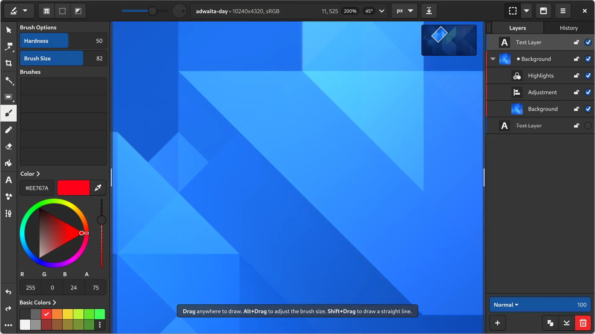
Neither project was successful, but this is one of the mockups they came up with:

I vividly remember that when I first saw this, I thought: “Looks interesting, but there is just no way this is going to work!”. And the main reason for that is…
GIMP’s complexity
There is a huge amount of commands and options built into GIMP’s menus and nested menus.
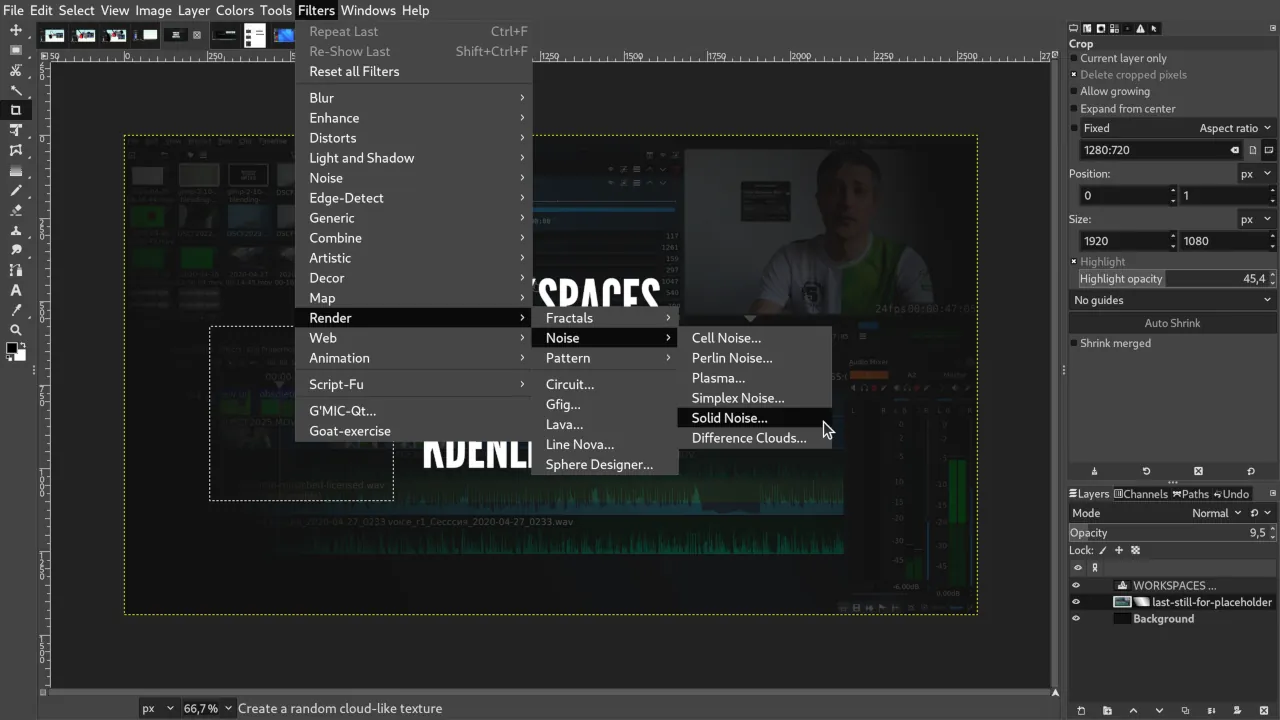
The program amassed all that over the years, and then the team tried to solve that with a search dialog:
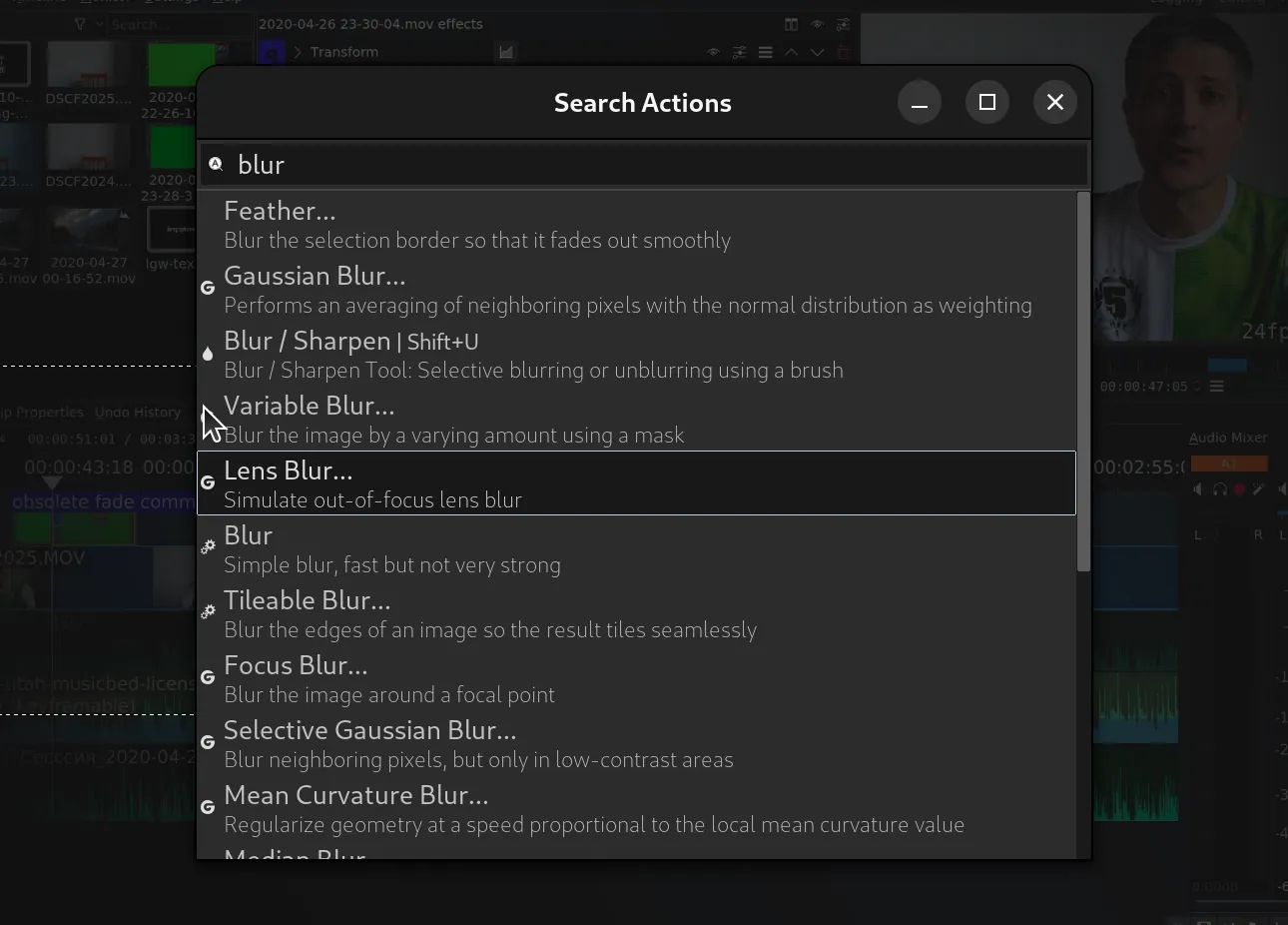
Which kinda works when you generally know what you need or how a feature you want could be called. But really not when this is your first rodeo.
Anyway, it is very difficult to represent all this complexity in an application that looks like the thing on the mockup above.
With GTK3 tech, one possible solution to do that is a dropdown menu in the headerbar, like in Siril:
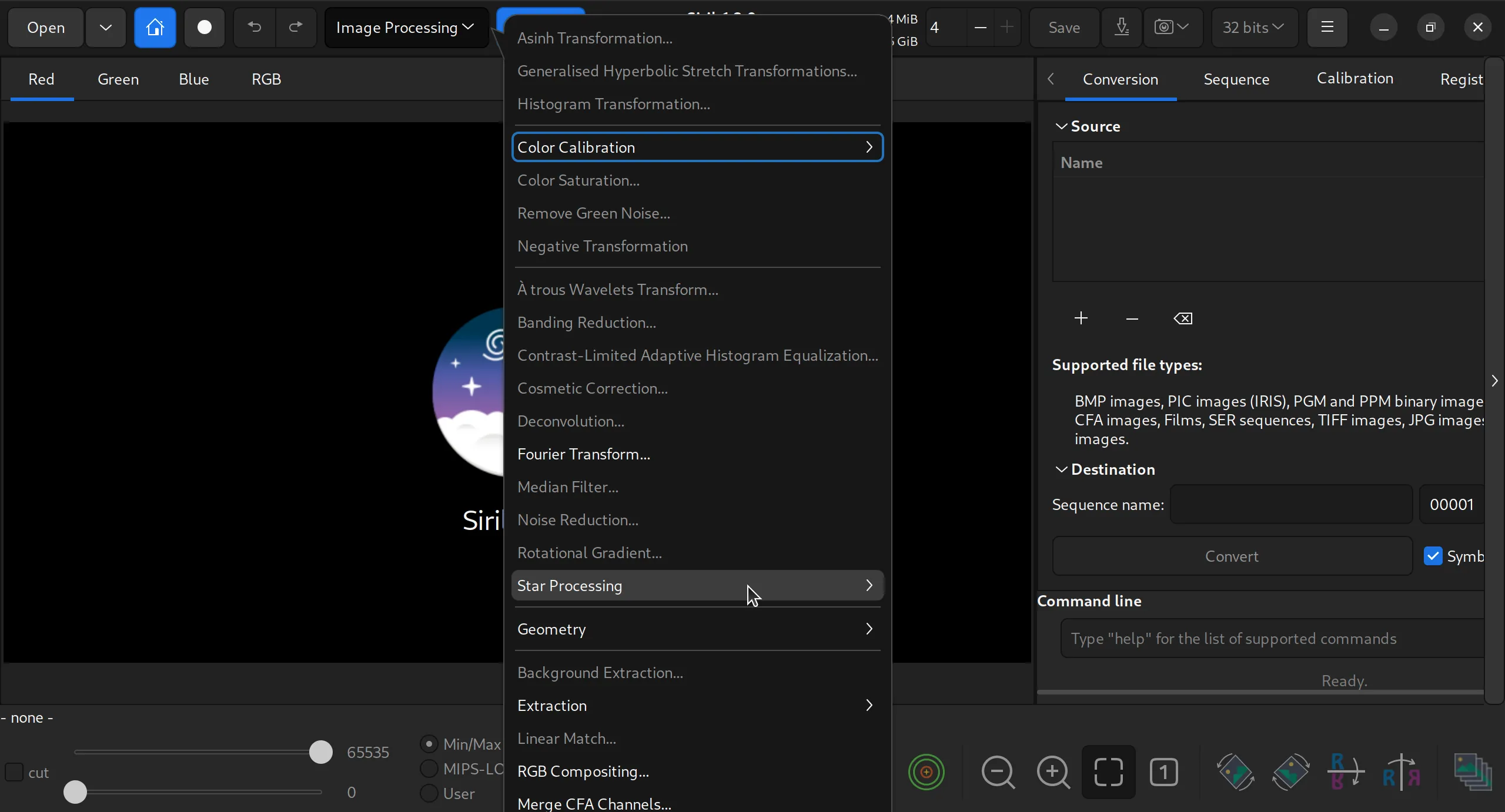
But this is not very convenient because when you go to a nested menu in one part of the screen, it opens in an entirely different part of the screen, and it’s very annoying.
And then again, how many menus like that can you fit into one headerbar before users run for pitchforks with a determined look on their faces? So it’s not really great, I think we could do better.
Enter Dune 3D
One possible solution is coming from a new application called Dune 3D. It’s a 3D CAD program built on top of Open CASCADE kernel and SolveSpace constraint solver — all the usual suspects.
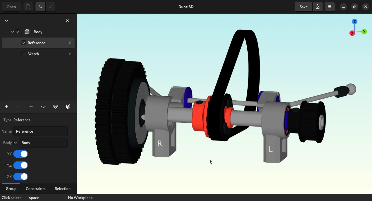
The developer is the same guy who came up with Horizon EDA, a GTK3-based electronic design automation package. Dune 3D is very, very new. The initial code import to GitHub was made just two weeks ago, so not a lot of people even know about this project yet, but that is beside the point.
The interesting part here is when you first look at this, you can’t help yourself wondering: “Okay, I get it, he barely started coding. Still, where is all the functionality?”. Well, since the status bar says “Press Space”, let’s do just that:
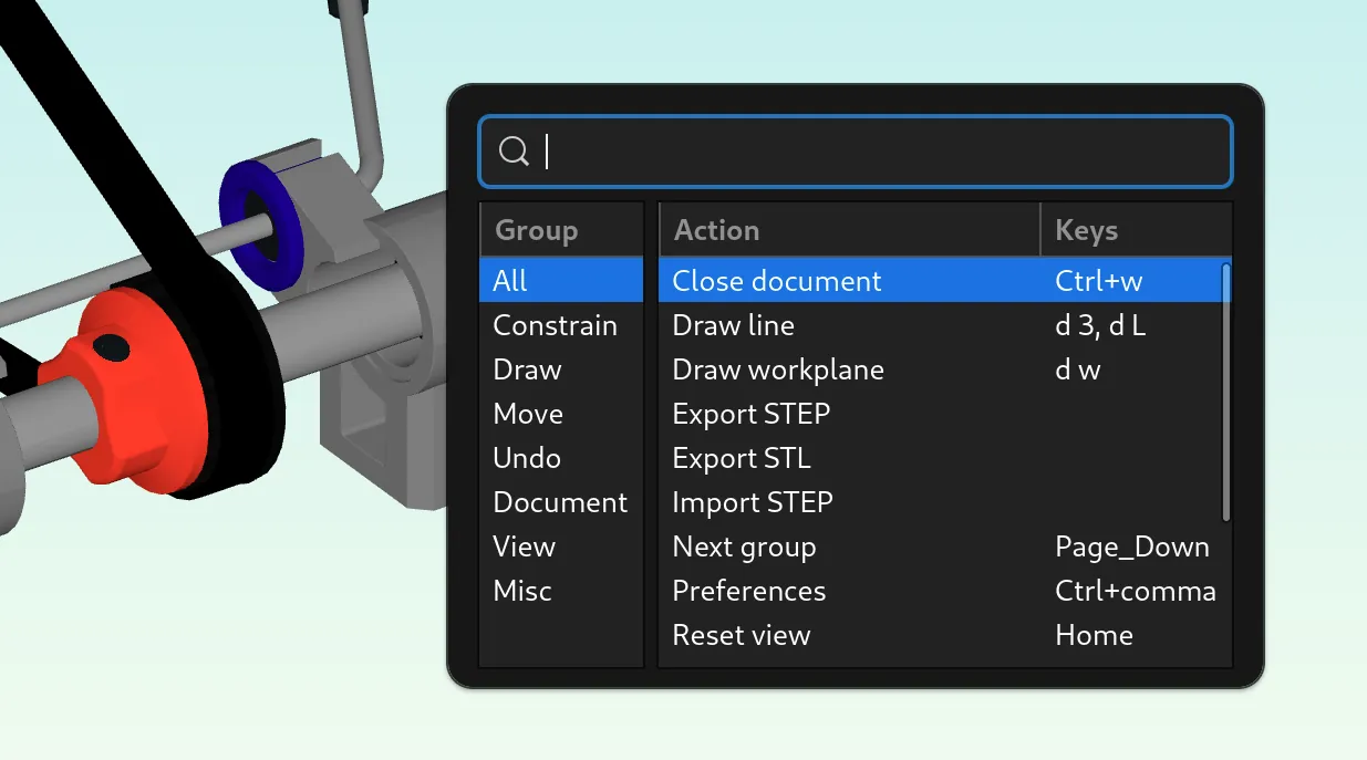
And that gets me really excited. Because you get the search bar for when you know what you’re looking for, when you know the terminology, when you understand what you need. And you also get a kind of menu that is helpful for when you need to navigate into the unknown and see all your options. So this is a very interesting solution that, while not perfect for a lot of complexity, could still be iterated upon, in my opinion.
Update: as the developer pointed out, this search/menu dialog has been available in Horizon EDA for the past 7 years, he simply reused his own code in the new program.
Interaction hints
Another interesting thing here is that when you do something like drawing a line, for example, you get these nice visual hints here about using the mouse, just above the status bar:
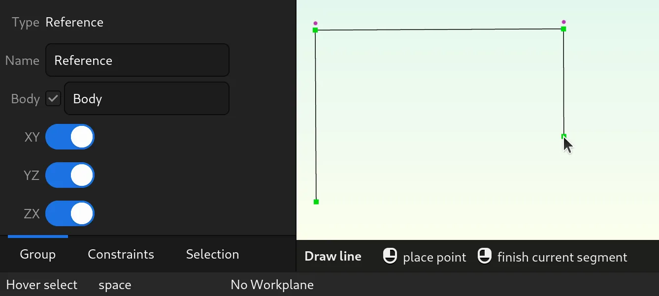
The idea is coming from Blender (obvious, if you are familiar with Blender), and it would make a lot of sense to use this in applications like GIMP and Inkscape. Here is a good reason why.
When you are coming from an application like Photoshop, you are used to do set of modifiers for working with selections. So when you create the selection and you need to add to it, what you do is press Shift in GIMP. But it’s Ctrl in Photoshop. A lot of people that I’ve met who come from Photoshop don’t really know that. And the only way they can find that out is by reading a tutorial or a user manual or maybe watching a YouTube video — the status bar hint isn’t specific enough, and not everyone finds the toggles in tool settings.
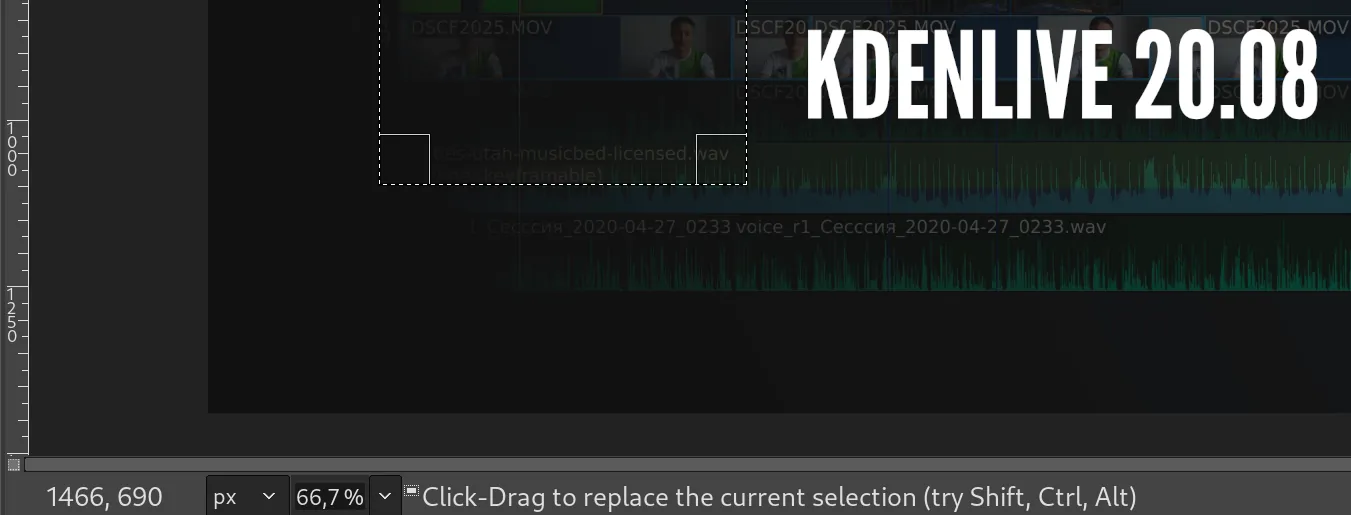
And the same applies, for example, to moving selections, because in GIMP, you need to press Ctrl+Alt and then drag to move the contents of the selection, which is not how people expect this to work coming from many other applications. Again, the only way they can find this out is by watching a tutorial or reading the user manual.
So that’s another thing that I think would make sense to sort of backport from Dune 3D to GIMP in the GTK3-based based version (or GTK4, since Dune 3D is GTK4-based). So I’m really hoping that at least this will be considered by the developers.
Thoughts?
I don’t think that the redesign that the Glimpse NX team came up with should be implemented as is. There are so many more aspects to discuss apart from access to functionality in menus, and the team explored some of those aspects too: how the headerbar should work, how exporting would be implemented, what tool settings would look like etc. (they removed the git repository with mockups and studies, but I have a local copy).
Their redesign definitely makes the program more approachable. And now this solution in Dune 3D probably makes a major deficiency of that design go away. Even more, the interaction hints seem like a great if overlooked idea that could also be a relatively low-effort job.
Trying to revamp GIMP’s UX/UI at any level, especially this much, is obviously a huge effort — or would be a huge effort if the developers would ever decide to do that. But I’m really interested in your opinion. Do you think this old redesign of the program could be revived thanks to Dune 3D?
Patreon subscribers get early access to my posts. If you are feeling generous, you can also make a one-time donation on BuyMeACoffee.
