Streamlining Inkscape for the masses
by Alexandre ProkoudineAn interview with the Inkscape team on better development process and UX improvements

It’s not a heavily guarded secret that I have an undying love for Inkscape. For me, it’s one of those applications I’m really excited to use every time I have some silly need for a vector graphics editor. Which is why everyone actively involved with the project is my personal hero, and I’m only happy to chat with them every once in a while about how the project is doing.
This time, I spoke to Chris Rogers (Vectors team, i.e. PR and communication), Tavmjong Bah (developer), Martin Owens (developer), and Adam Belis (UX guy).
Q: So, first off, I love a lot of things going on with Inkscape lately. There was a, well, not a moment, but quite a long period of time, actually, when I was a bit scared for the project. Long dev cycles, not enough developers etc. Things seem to be so much better these days. What would you attribute it to? What did you have to change?
CRogers: better organisation internally helped. A move to RocketChat and Gitlab to track issues and multiple groups for different parts of the project seem to really have helped. Also, sharing successes and mutual respect and gratitude creates motivation, and it’s easier to do that with organised chat and group structures.
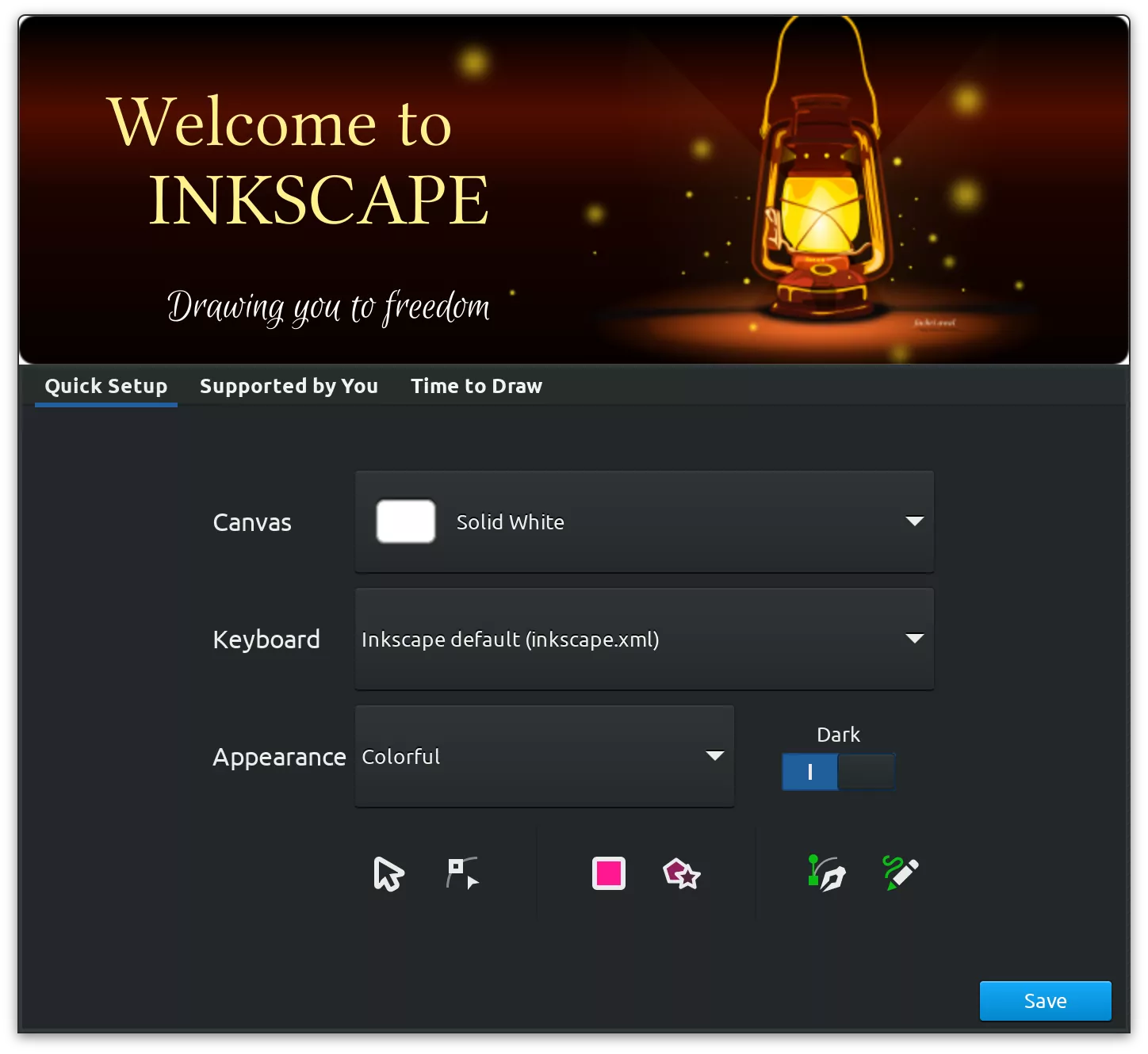
As always, a considerable effort by all our developers to make a great release really helps. Possibly having a release video to showcase that work adds to the feeling of achievement, and a place for users to say thanks for all the hard work. It’s really motivating to see. Feel free to steal/modify or otherwise reinvent our welcome screen, just give the user the opportunity to banish it if they feel they don’t want one. ;)
Tavmjong Bah: I agree with Chris! RocketChat and Gitlab. I would add the important contributions of the “Vectors” team who have done lots of great work which helps build the Inkscape community (and offloads a lot of stuff developers didn’t do so well in the past like release notes).
Adam Belis: I don’t feel like we have more devs since I joined 3 years ago. I still feel like the project is lacking people on all fronts: org, dev, UX, documentation, etc.
From what I understand, what helped was finally porting the user interface from GTK2 to GTK3. It was just a huge task and brought many regressions, some of them are still in even after 2 years. Just to compare, 1.0 was in alpha state for 1.5 years; but for 1.1, it was just 3 months. So if you want a faster release, don’t port your app. Too late for us though! And we probably need to port again to GTK4 now if we want to fix performance regressions.
Another thing that changed is release strategy/schedule. We are aiming for timeframes, not the features. Major release should be out every year, minor — every 4 months.
And yes, having a place like our RocketChat and GitLab where you can build relationships with people in the project helps a lot. Good UX for contributors is very important.

Q: With my GIMP hat on, when I saw the new greetings customization dialog, I was, like, we should be sooo stealing this for GIMP! :) We had that sort of thing long ago, people were furious having to click through stuff, so we ditched it. Some 15 years later, we have a 50/50 split between users of dark/light themes and maybe a 50/50 split between users of grouped/ungrouped tools in the toolbox. So we are taking notes, because now even Blender has a basic first-start setup dialog for basic workflow things like left/right click for selection etc. For Inkscape, did this new feature come from necessity?
CRogers: That dialogue was a joint effort between Martin Owens and our recently formed UX team (with template icons by yours truly). It’s a work in progress, but does go a long way to making Inkscape feel like a more professional application and not just a hobbyist project.
Part of that comes from being able to display some great professional artwork made by our talented dedicated community of designers and illustrators, and also the ability to give the user quick-start customisation options. It was not an easy thing to decide on, and there was significant conflict within the project on whether to include it at all.
A year or so ago we, as a project, decided to leave decision making about Inkscape’s UI to the UX team (which developers can join in the conversation). The decisions that come out of that group are basically “marching orders” for developers of the thing, whatever it is. It’s what developers wanted — carefully thought out and considered UX from designers who use Inkscape in production, and also have some experience in UX.
We consider the options, the pros and cons, do some user testing, and give the results to developers, who have been awesome in doing just what they said they would do with the work — implement it.

Do you have a plan going forward when you unavoidably add major changes that require users’ decision? Meaning, will you keep adding more options to this dialog?
Adam Belis: Hopefully, no. Only if we would add some new customizable option to the theme. This should be seen by users just once after they install Inkscape the first time. I would much rather fix the UX of our crazy theming settings.
Q: In fact, what’s your plan for UX design going forward? Some software projects rely on testing ideas on focus groups, which I don’t think you do yet. And some will implement telemetry and let people test alpha versions, which, judging by recent Audacity confrontation, doesn’t sit well with users. And it’s hard to neglect user-focused design, especially with such a complicated piece of software like Inkscape. So do you have a plan for UX work?
Adam Belis: Our current workflow really depends on case by case. We try to encourage devs to ask for UX help ASAP — sooner than they start doing any coding. Then test and give feedback as the feature is developed. If nobody is sure or we have a conflict with opinions, we try to design studies or ask the community or find solutions we all can agree on.
New, cleaner, and more compact page settings design has landed to the main development branch of @inkscape. This will be part of version 1.2 expected later this year. Patch by Mike Kowalski pic.twitter.com/uRkSMq23F6
— Libre Arts (@lgworld) January 13, 2022
We do testing when we are not sure about our solutions. We would like to do more, it’s just so much work. Also, our testing workflow still sucks. I am poking our devs to improve it by having experimental MR build on the site so they are easier to test. Anyway, “Pasting on top of selected objects” is probably our best UX study we did so far.
Q: There seems to be a pattern this year with Google Summer of Code projects for Inkscape: lots of on-canvas stuff. Boolean ops, marker editing, smart guides. Was it a happy coincidence or more like an orchestrated UX push?
Adam Belis: It’s 50/50. I told all students to look for ideas in our UX tracker, and these tools are popular in general. It’s much nicer to click on the canvas than looking for specific dialog or remembering shortcuts.
But I also think this is a design pattern that Inkscape uses in general — editing everything on the canvas. But at the same time, we are missing so much editable stuff, e.g. we still cannot easily edit symbols and patterns.
I was one of the people to give feedback on GSoC proposals, so that could have played a small role :D Now when I think about it, I had help with designs most of the time :D
Q: Some 6 years ago, in an interview (back when Libre Arts was Libre Graphics World), we spoke about performance issues, and Tav mentioned that Inkscape suffers a lot from what he called cargo cult programming :) You did a lot of cleanup while working on both 1.0 and 1.1 (and before that, of course). What does your gut feeling say? How much is there left to do in terms of major changes?
Tavmjong Bah: Lots of cleanup done but much more to do! We still suffer from too much cut and paste but we’ve moved to using Git Merge Requests which makes it easier to review code coming in.
Adam Belis: Yes, performance is still not good, we still do not have the performance of v0.92. Windows users suffer a lot, but macOS users — even worse. We discussed having another GPU render engine but … That’s a topic for a few more years.
Q: Every time there’s a new Inkscape release, I generally see a lot of excitement because every time you bring something important to the table. But I also see a lot of resentment, because, well, I’ve seen many people who are unhappy with Adobe subscription plans. They seem to genuinely want Inkscape to work for them. But they can’t switch because of whatever missing feature and they don’t write code. So they either stick with Adobe for the time being or maybe go for smth like Affinity Designer. And they are really loud about it. How do you mentally deal with the negativity that comes out of it? How do you channel it to something productive?
CRogers: No push for change comes without discomfort. There’s a difference between people who are just frustrated with lack of particular features, and trolls who want validation for their store-bought sense of professionalism. It’s important to listen to genuine complaints, and possibly turn a rant into “this user really wants X feature”.
You might have noticed the information gathering in the Facebook group regarding CMYK workflows.
Oh yes! That was a fun thread to read :)
CRogers: Yeah, we do listen to our users and we do want to deliver things that will allow people to switch and live more comfortably in the FOSS world, one step closer to being free of proprietary software.
Adam Belis: I get where they are coming from and usually tend to agree with this type of criticism. We have some big UX issues and some workflows are objectively worse than Adobe’s or Affinity’s. We usually have 98% of their features (and some more they don’t), just with the worse UX :D. I read a lot of feedback but I guess I just don’t take it personally. I am a loud critic of stuff in the project myself!
Pages tool just landed to main dev branch of @inkscape. Create new pages from presets or draw them freely, fit pages to contents, change order of pages, delete them easily. Smart guides work across multiple pages. Expected in v1.2 the coming spring. Full review to follow pic.twitter.com/80rRGrJQvA
— Libre Arts (@lgworld) December 10, 2021
Martin Owens: I talk probably the most to Affinity and Illustrator users, I ask them what they’d like to change in Inkscape, if they had the power to. Sometimes I remind them that it’s a public project, a charity, it depends on the context of the message. But it’s important to give a lot of these users a different sense of ownership than they are used to with their proprietary tools. This isn’t a “wait until the master gives me my favourite biscuit and a pat on the head”, it’s more of a “get involved and affect change” sort of problem.
Q: Speaking of which… Martin, you are the most sponsored Inkscape contributor of all who have a Patreon page (Tav, Jabier, Marc). But the donation still wouldn’t make a living. I get it that these things don’t happen overnight, it takes time. Do you think this has the potential of growing into a sustainable income? Or is an orchestrated centralized effort to fund development still on the table?
Martin Owens: The charity funding is not just on the table, it’s required to be used correctly. As a charity, it’s important that the funds be used for the public good. Which means that the kinds of projects that the charity fund would pay for must be viewed from the perspective of doing the greater public’s best interests. These projects will be very important items for most, if not all users.
But there will always be a need for the private good, for involvement from people who want to move their own niches, particular focuses or business needs forward. This private good I offer through both contracting and funding like Patreon gives non-developers an important ability to have someone listen to them directly and work towards their private goals. Without which many users would not be able to access quality development resources and get their contributions into the project.
These two methods of funding shouldn’t be confused, or in competition. They serve very different needs and both should be pursued as strongly as possible.
My Patreon account already provides sustainable income. It’s proportionate. If it falls, my hours fall, if it rises (up to a point), my hours increase. If there aren’t many inkscape hours, then I can work on other things for that time.
As for centralized funding, we do have a budget for 2022 with assignments for both development and non-development tasks.
Featured artwork by Victor Kirilchuk.
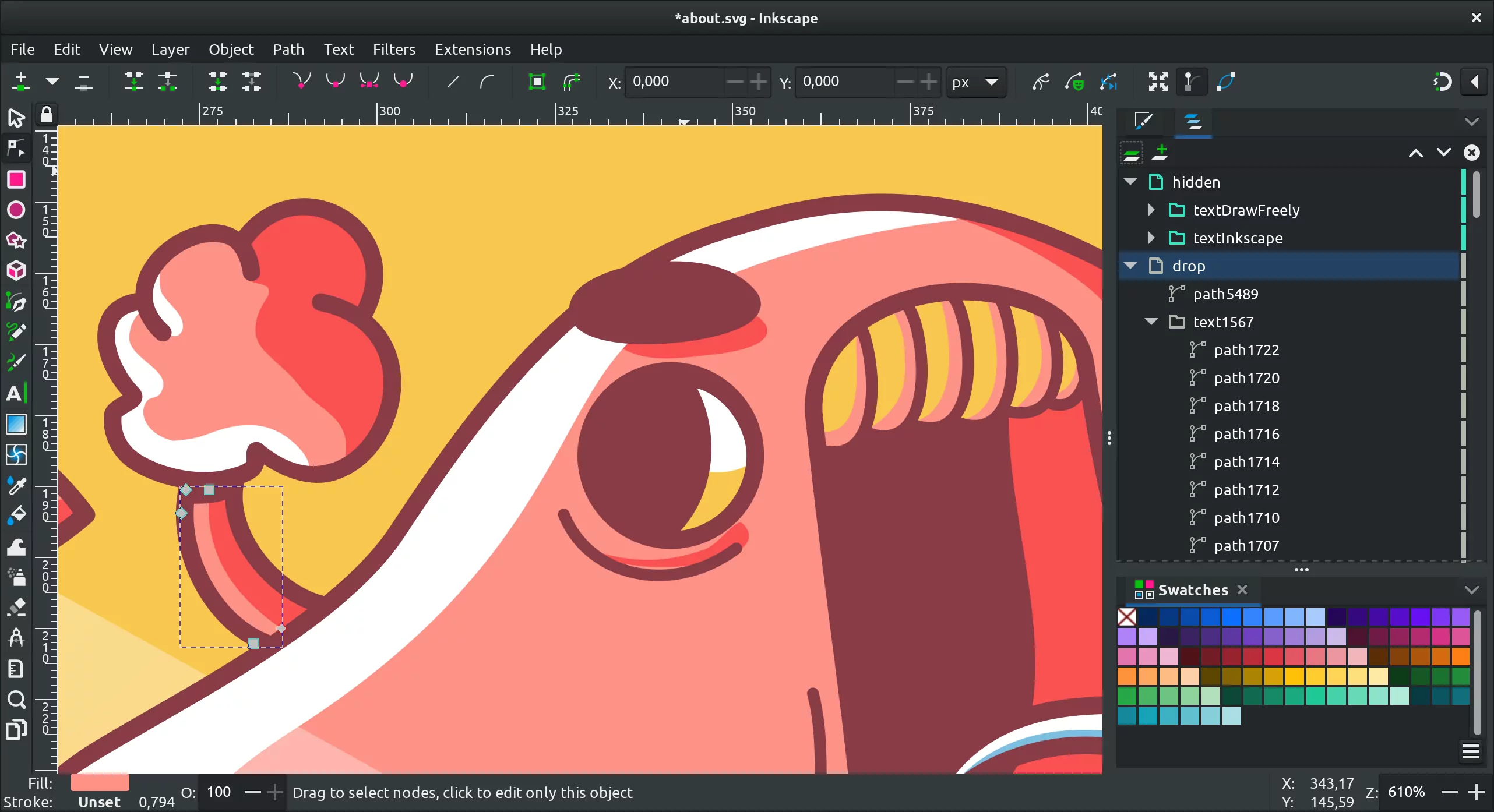
All original About screen artwork on screenshots was created by Ray Oliveira, available under CC BY SA 4.0.
As usual, thanks to everyone at Inkscape for being extremely patient and understanding with me :)
Patreon subscribers get early access to my posts. If you are feeling generous, you can also make a one-time donation on BuyMeACoffee.
