How design freebies cause cancer and eat babies
by Alexandre ProkoudineHave you ever heard horror stories, how free design assets from teh interwebz should be avoided at all costs? Is that real or made-up?
Have you ever heard horror stories, how free design assets from teh interwebz should be avoided at all costs? Is that real or made-up?
LGW makes a detour from its usual topics to give you some good old-fashioned nightmares.
“Color management’s easy-peasy, you just google for an ICC profile”
When I got my first DSLR (Canon 350D), I started grokking color management, but, apparently, not hard enough. I really did think I could just download an ICC profile from the Internet, and I’d be good to go. Ah, youth…
One of those profiles was Canon Digital Rebel XT (0509wg22).icm, fetched from one reputable website. Getting it to work was pretty much impossible, but I had no tools for “debugging” at hand at the time, and, most importantly, no knowledge.
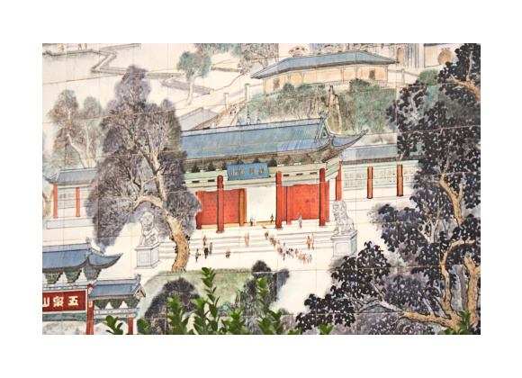
Today I’d have a hard time compiling UFraw from 2005 just to precisely reproduce the issue again. So to give you idea, here is a rendering of a photo with advanced color matrix in darktable:
And here is the same picture rendered with that very profile:
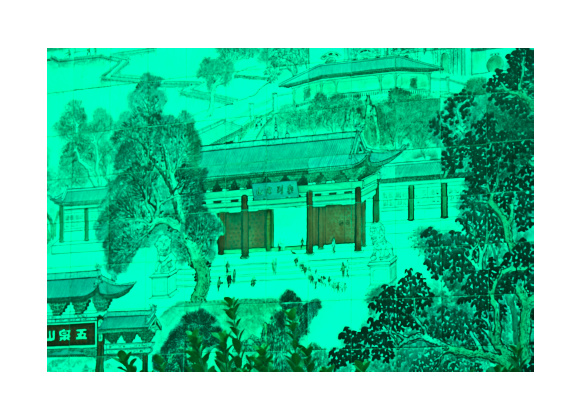
That looks seriously broken indeed, but probably doesn’t send a shiver down the spine as such, does it?
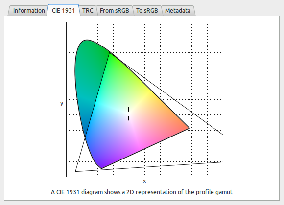
In late 2010, Richard Hughes released the first public version of GNOME Color Manager with built-in “horseshoe” diagram view that displays color gamut and, soon after that, a TRC diagram view.
I knew a lot more about color management by the time, and I always had a soft spot for underdogs, so I opened that ICM file in GNOME’s ICC profile viewer…
Watcha, here’s one DSLR that actually captures infrared, and you never knew:
You could also use it to tune to a radio station
Oh, and the curves feel a bit under the weather too.
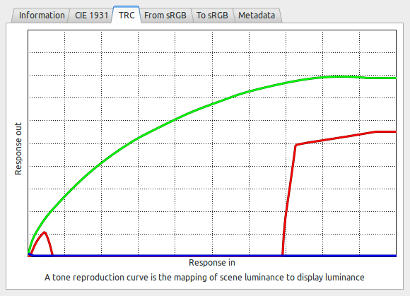
Well, fancy that!
While this is a pretty harsh example, it really does serve as a hyperbole to illustrate the point: arbitrary color profiles from Internet are not guaranteed to work as expected.
If you are not sure about what you downloaded or even created, GNOME’s profile viewer can work as a basic diagnostic tool. For more serious analysis try ICC Examin.
“I ain’t paying for no fonts, I gets’em good and free”
Last autumn I felt like replacing the logo placeholder here at LGW with something more sensible, so I asked a fellow typeface admirer for an advice. (Have I already mentioned that I lack any artistic skills whatsoever?)
He listened to my incoherent explanations, scanned FontSquirrel quickly and pointed out a font that could work as a brand font for the project.
That font was FORQUE.

No problems so far? Just you wait…
I didn’t like some design decisions which can probably be explained by description from the designer himself:
A font that looks like it’s designer; big, old and fat. I needed a font for a 3D model of an old movies studio, and I made this. No lower case, only small caps.
But it did look industrial enough to me, and so I spent some time trying it this way and that way. Until something annoying grabbed my attention:

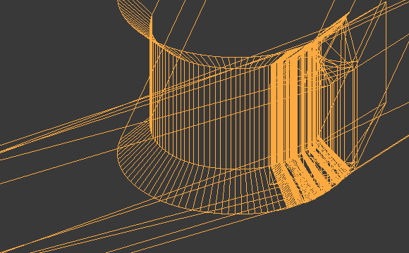
Wait, what? Is that a cluster of nodes?
So I zoomed in:
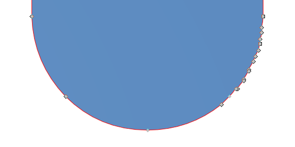
Indeed, it is a cluster of nodes. Could be a whole solar system lurking there.
One might say: OK, no big deal. You need it at small size for screen graphics anyway? End of problem, no?
That is not until you try to use it in Blender. The first thing you see after loading the font for a flat text object is that there is something fishy going on.
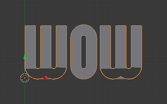
So you try to render the scene out of curiousity or mischief, only to find that it’s indeed broken.

Wait, what if we add some extrusion and add some bevel. At first the issue seems to be gone, but as you keep adding bevel…
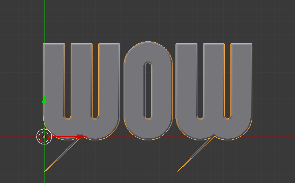
OK, in the eyes of an artist a ‘W’ letter could look a bit like a butterfly, but a fine rare sample of a European swallowtail?
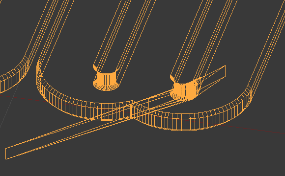
As you switch to wireframe mode and zoom in to inspect, you really start understanding how badly mere extra points in a path can screw up a font and a text object.
For checking fonts it’s best to use FontForge which will spit out list of bugs it discovered upon loading of a font file. Alternatively you can use fontlint which is pretty much the same problem checker from FontForge, except implemented as a console utility.
FontForge/fontlint are quite paranoid and will complain about every single prank that the type designer ever did. Not all of them need to be done away with, but you wouldn’t believe how many free fonts around are lacking such a simple thing as a point at extrema.
Fortunately, you can tell FontForge what problems specifically to look for. Use “Element/Find Problems” command or use Ctrl+E to fire up the dialog with options. Some of the issues that FontForge can detect can be automagically fixed:
FontForge is a helpful lad
By the way, the font that’s currently used in the LGW logo, CuprumFFU, is officially unstable. Some people just never learn, eh?
Freebies vs. the world
Despite of everything you read here, don’t fall for anti-freebies advocacy. There are excellent free assets, and there are some quite horrible assets that people want you to pay for.
The world is just a tad more complicated than that. But there’s always a place for catchy headlines.
The solution? Personally, I strongly suggest checking all 3rd party assets you lay your hands on for using in a commercial project.
While at that, I’d really love to hear some horror stories about 3rd party assets wreaking havoc and bringing more sadness to this cruel world. Along with solutions maybe? Would you like to share some?
Fire photo in the top image is (C) by Joe Skinner, CC BY NC ND 2.0.
Patreon subscribers get early access to my posts. If you are feeling generous, you can also make a one-time donation on BuyMeACoffee.