How to study type design with Fontmatrix
by Alexandre ProkoudineStudying how other people do type design will help you become a great designer yourself.
Type design is something that never lets you go once got a basic grasp of it. And studying how other people do it is an important part of getting there.
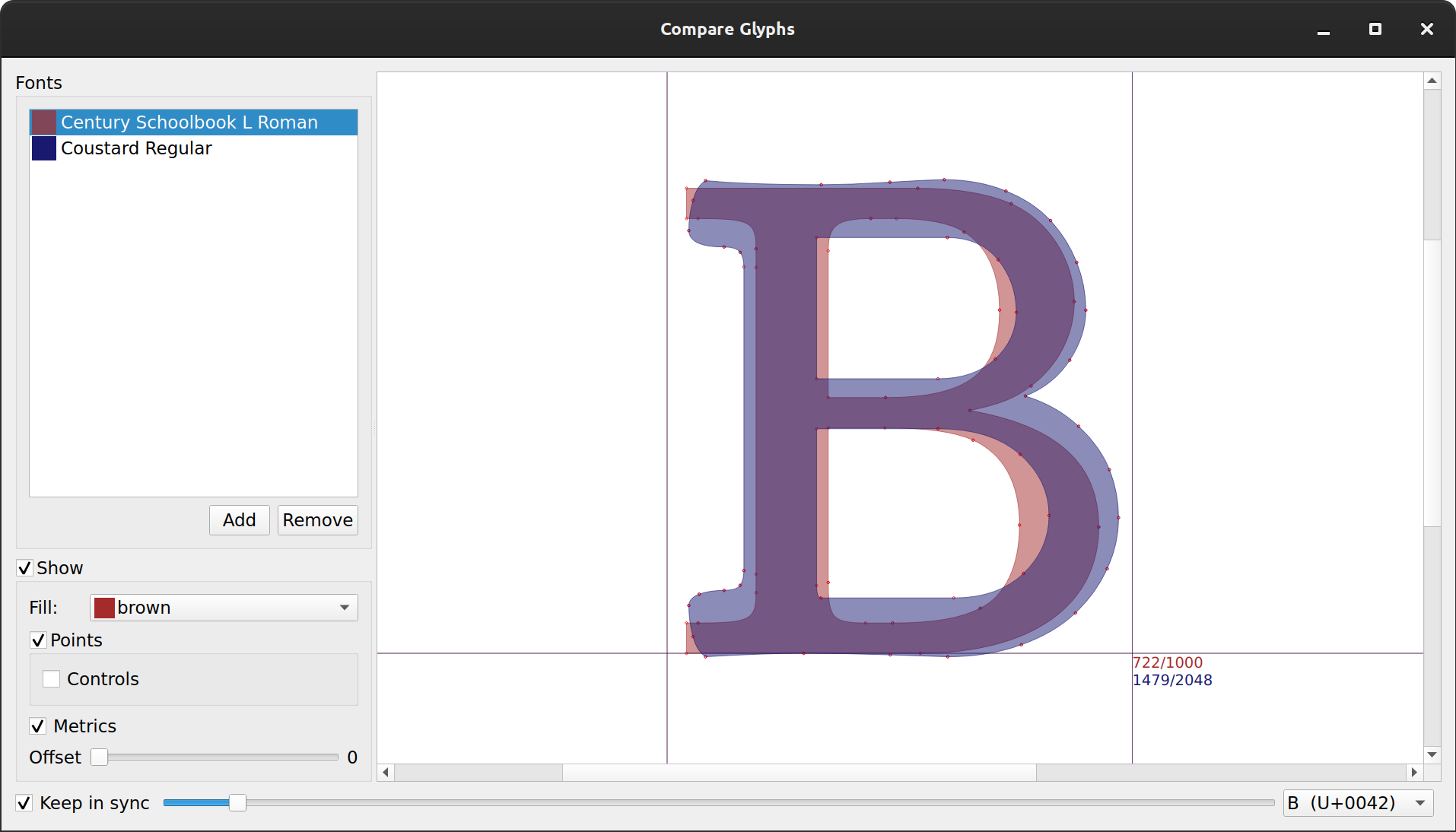
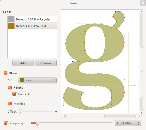
When you explore fonts created by others, you often need to compare weights within one font family or same glyph in completely different fonts. Looking at how glyphs are constructed, that is, at nodes and control points, is another popular thing to do.
You can use a combination of a vector graphics editor and a font editor, but luckily you don’t have to. It is often overlooked that all of that is perfectly doable with Fontmatrix, a free application for exploring and managing fonts. The application actually goes beyond enabling and disabling a bunch of typefaces and has a mode to compare glyphs.
Here is a short video that demonstrates how it works:
Let’s break it down. You can add several (actually, as many as you like) fonts for overlay view and control color fill of glyphs, as well as general visibility:
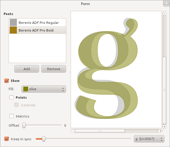
You can also enable display of path nodes, their control points and glyph metrics:
The interface for choosing which glyph to use is quite geeky, but then it gave birth to this fancy video :)